Color Properties
Learn the precise words for how color changes: hue, shade, tint, tone, lightness, value, saturation and opacity.
"Make it a bit lighter" or "this blue feels too loud" are hard to act on. Designers use a small set of precise words instead: hue, shade, tint, tone, lightness, value, saturation and opacity. Each one names a single way a color can change, so teams can say exactly what to adjust and design tools can set it.
Hue
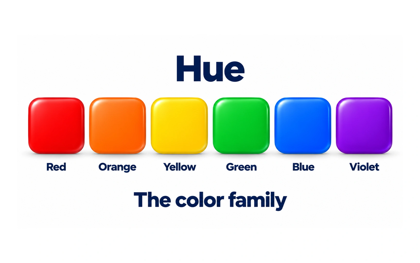
Hue names a color family, such as red, orange, green or blue. The illustration changes the family from tile to tile while keeping the shape and arrangement consistent.
Hue is separate from how pale, dark or muted a color looks. A light blue and a dark blue can belong to the same family.
In a hue-based color picker, moving around the hue control changes this family. Neutral gray has no visible hue, even when a tool retains a hue setting.
Shade
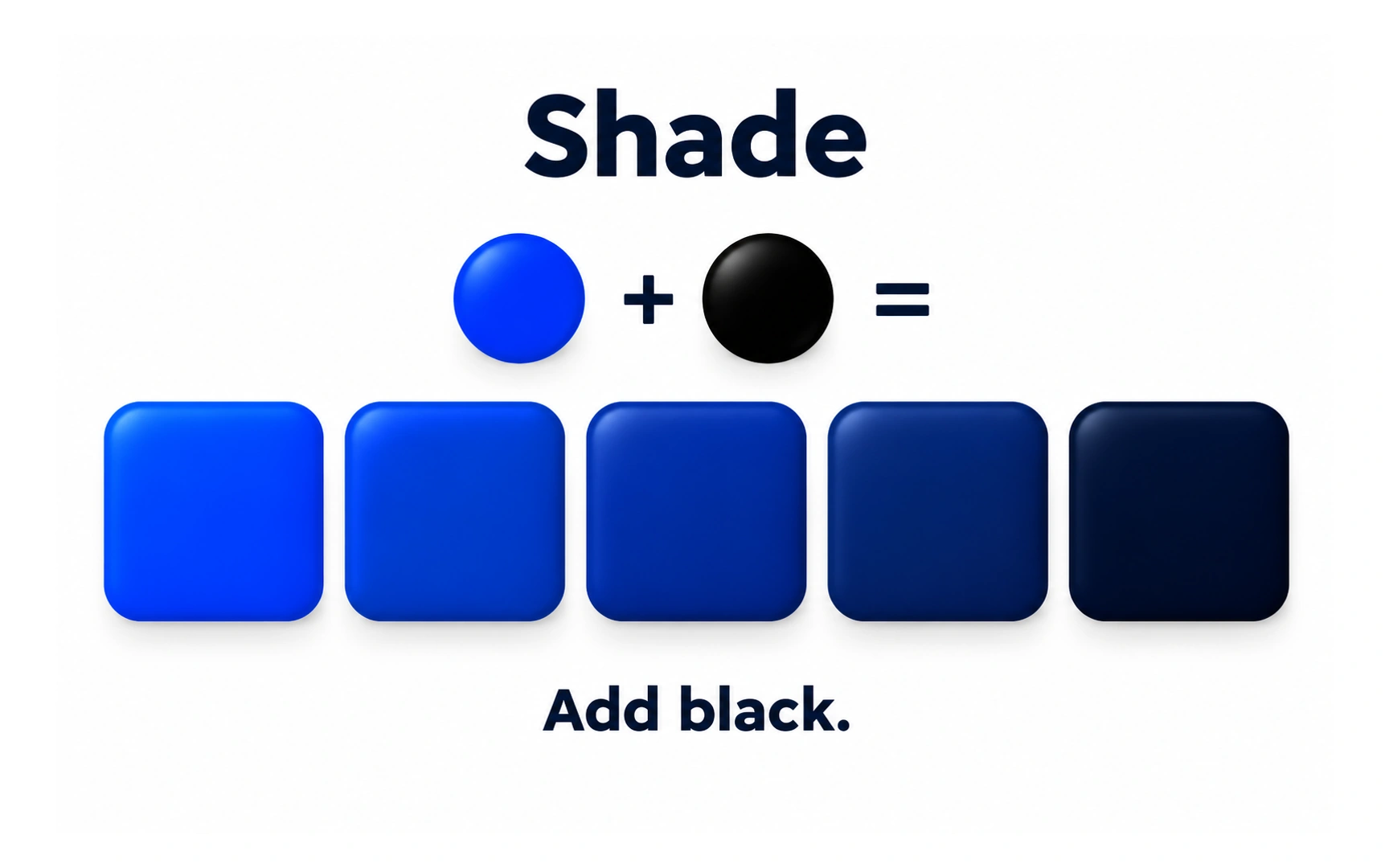
A shade is made by adding black to a color. The blue tiles show progressively darker versions of the same starting color.
This is a useful way to describe a palette, rather than a promise that every digital color control imitates mixing paint. Different color models expose different controls.
Use darker variations where the interface needs them, then check the actual foreground and background together. A darker color alone does not guarantee readable contrast.
Tint
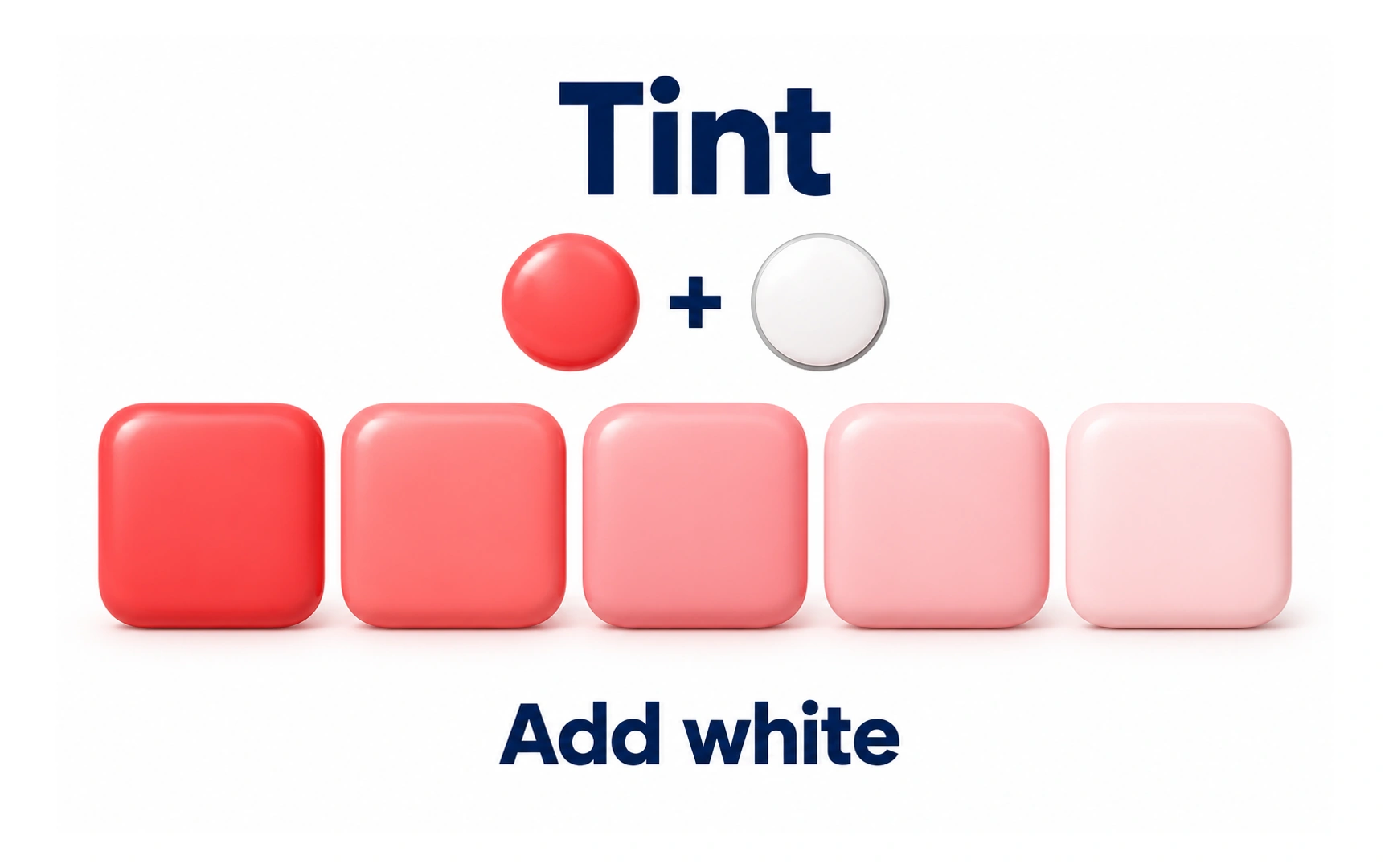
A tint is made by adding white to a color. The coral tiles become paler as the amount of white increases.
The hue family remains recognizable while the mixture moves toward white. This differs from a shade, which moves toward black.
A pale surface can support a stronger accent, but pale text on white can be hard to read. Choose a tint for its role and check the finished combination.
Tone
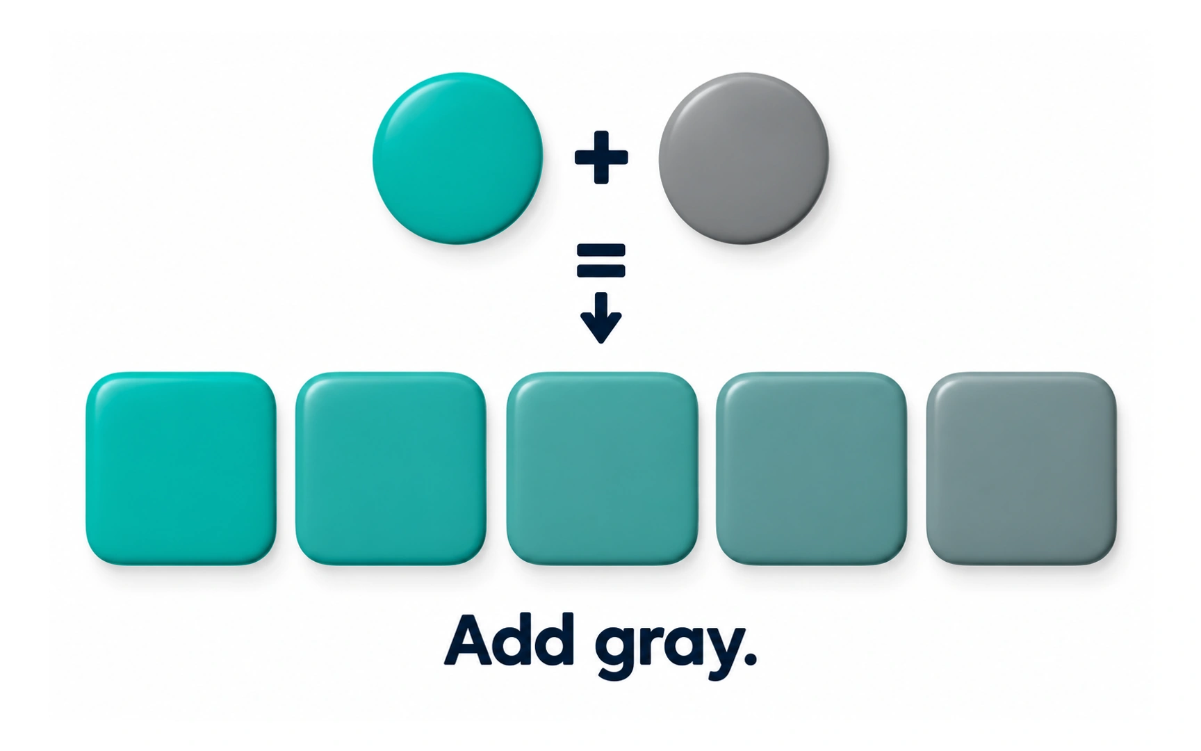
A tone is made by mixing a color with gray. In the illustration, vivid teal gradually becomes more muted.
Compare this with the other mixtures: black creates a shade, white creates a tint, and gray creates a tone. These terms describe different changes.
Muted colors can reduce competing emphasis in an interface. They are not automatically better or more sophisticated: choose the intensity that supports the content.
Lightness
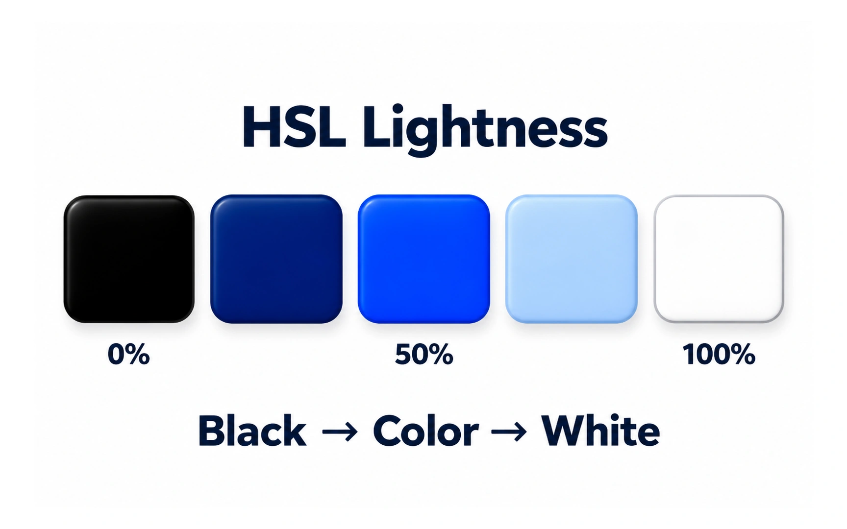
HSL stands for hue, saturation and lightness. At 0% lightness the result is black; at 100% it is white, whatever the hue setting.
With saturation held at 100%, the blue example is vivid at 50% lightness. Below that it darkens toward black, and above that it becomes paler toward white.
HSL lightness is a color-model coordinate, not a reliable measure of how bright two different hues look to people. Check contrast separately.
Value
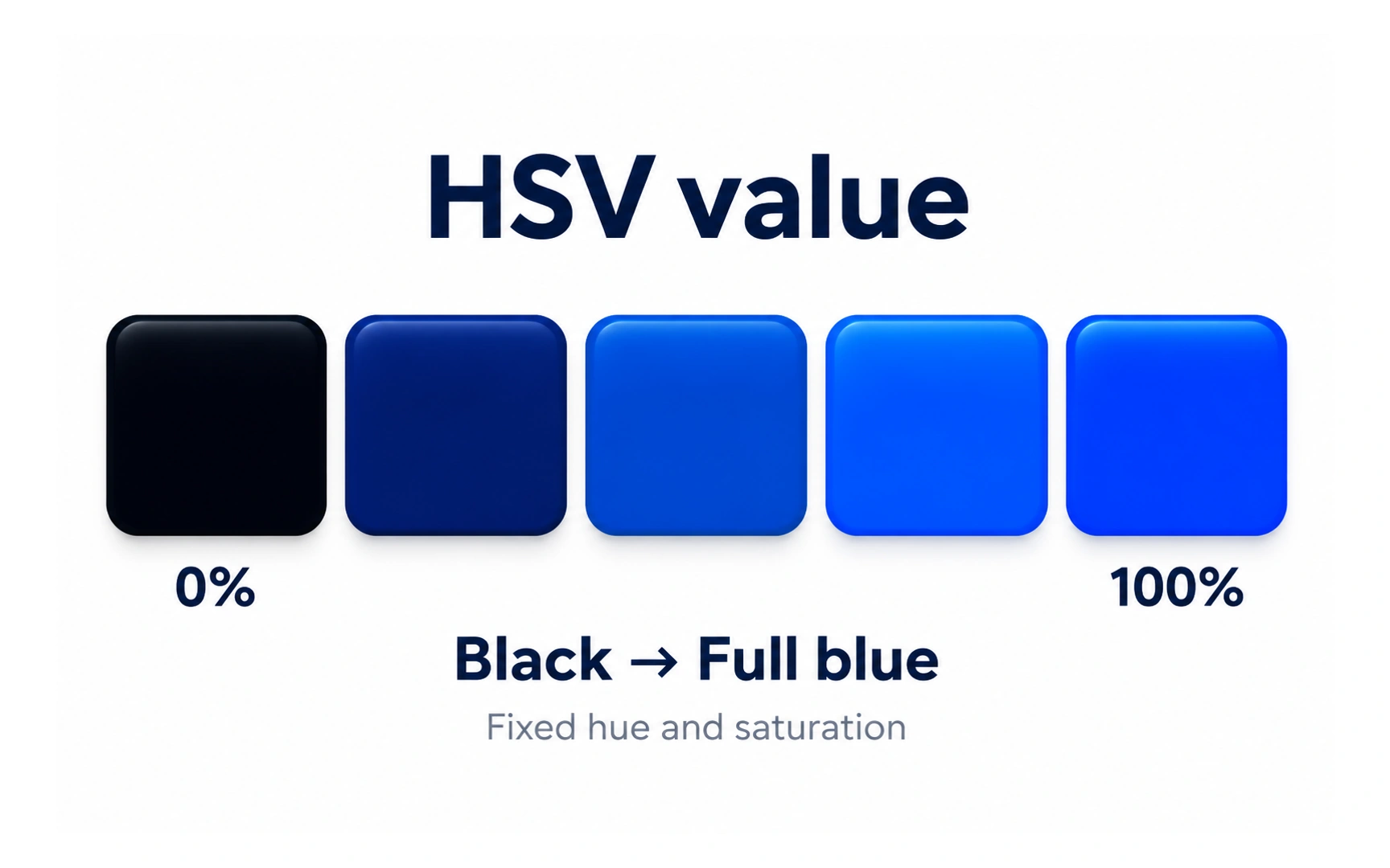
HSV stands for hue, saturation and value. The illustration holds hue and saturation fixed while increasing value from black to vivid blue.
At 0% value the result is black. At 100% value a saturated blue remains blue; increasing value does not necessarily make it white.
This is the key difference from HSL lightness. HSL reaches white at 100% lightness, whereas the result at 100% HSV value still depends on saturation and hue.
Saturation
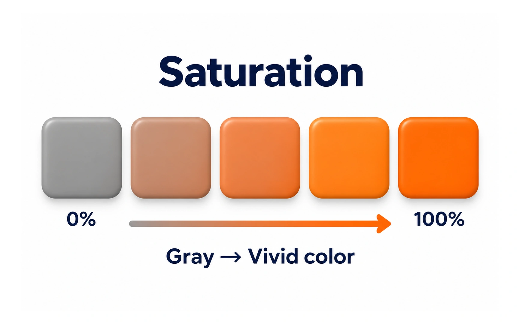
Saturation describes how chromatic or vivid a color is within a color model. The example moves from neutral gray toward vivid orange.
At zero saturation there is no visible hue. Increasing saturation brings out the color, while the other settings also influence its appearance.
Do not confuse saturation with opacity. A muted gray object can still be fully opaque; reducing saturation does not reveal the background.
Opacity
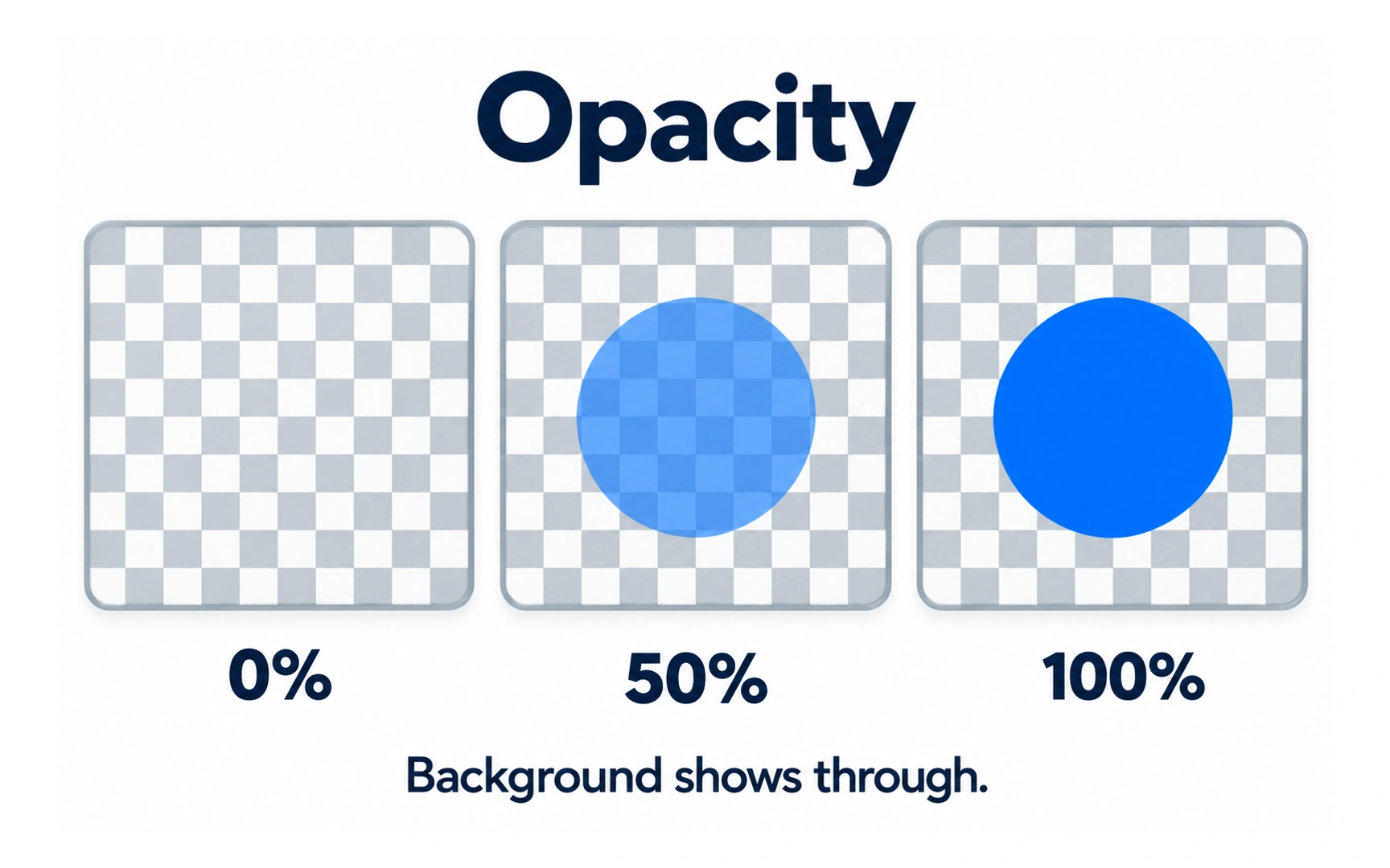
Opacity controls how much an object hides what is behind it. The same blue circle is transparent, partly transparent and opaque across the three panels.
At 0% opacity the circle is invisible. At 50%, the checkerboard shows through it. At 100%, the circle covers the checkerboard inside its boundary.
Changing the background changes the appearance of a partly transparent object. Judge overlays and text on their real backgrounds, rather than treating the blended result as one fixed color.
REFERENCES
TOPICS
FROM COURSE