Type Basics
Learn the main typeface families, what makes a font, and how to load type on the web so text stays readable.
Text carries most of what a product says, and the type you choose shapes how it feels and how easily people read it. This lesson covers the main typeface families, the difference between a typeface and a font, weights and styles, and how fonts load on the web.
Typeface
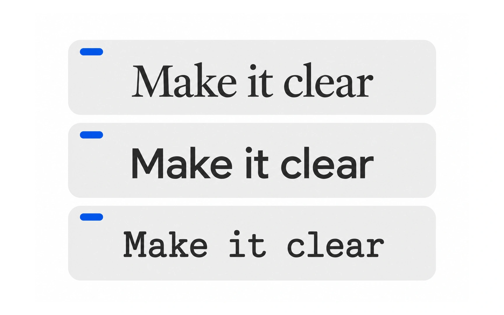
A typeface is the design shared by a whole set of characters: letters, numbers, punctuation and symbols. Helvetica, Georgia and Courier are typefaces.
People often say "font" when they mean "typeface". A font is one specific version of a typeface, such as Helvetica Bold at 12 points. You will learn more about fonts later in this lesson.
The same words feel different in different typefaces. "Make it clear" set in a serif, a sans serif and a monospaced face reads as classic, modern and technical. Choosing a typeface is choosing a voice.
Serif typeface
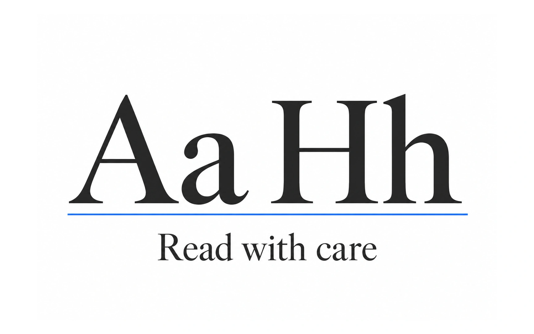
Serif typefaces have small finishing strokes, called serifs, at the ends of their letters. Look at the feet of the H or the top of the a.
They are among the oldest styles in print. Nicolas Jenson cut an influential roman serif typeface in Venice in 1470, and its shapes still echo in many book faces today.
Because of that long history, serifs often feel classic, trustworthy and editorial. They suit news, books, finance and brands that want to look established.
Sans-serif typeface
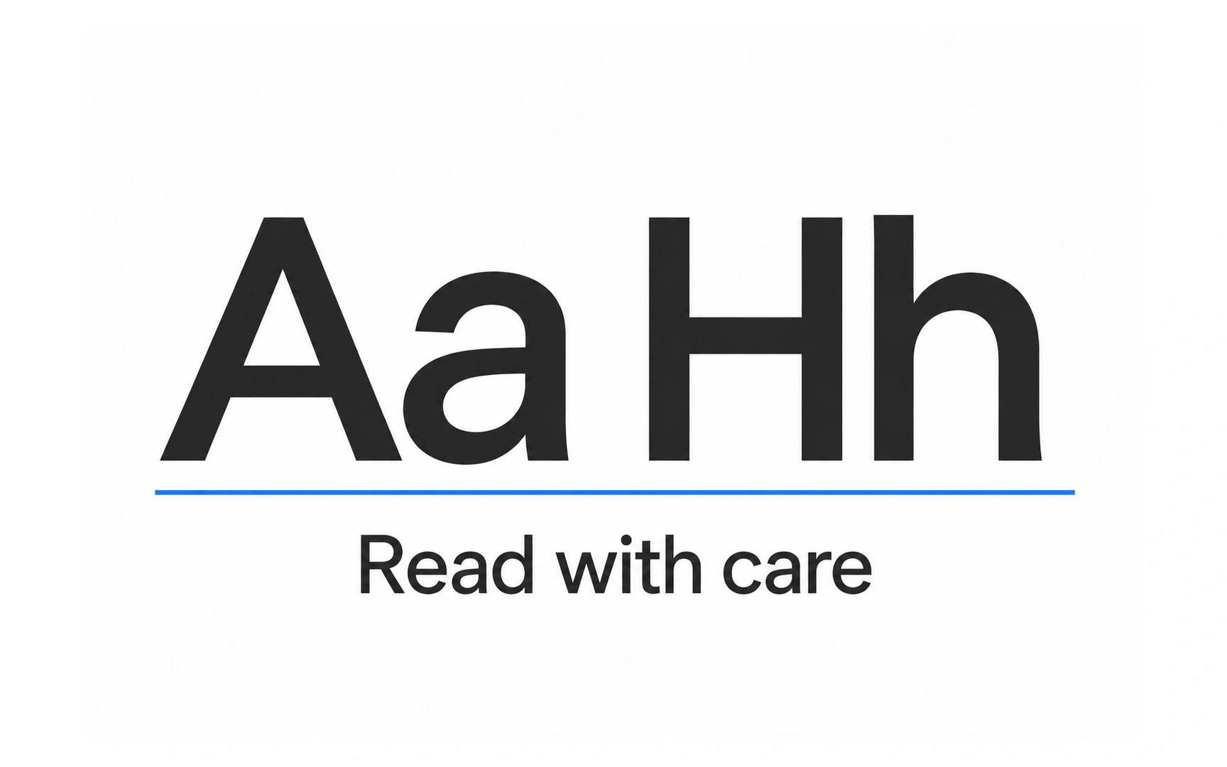
Sans serif means "without serifs": the letters end in plain, clean strokes. They tend to feel modern, simple and neutral.
They are not as new as they look. Caslon Egyptian, from around 1816, is often cited as the first sans-serif typeface for printing.
Sans serifs are a common default for interfaces, from buttons to body text. People sometimes say they are easier to read on screens than serifs, but research does not settle it; size, spacing and contrast matter more than serifs.
Script typeface
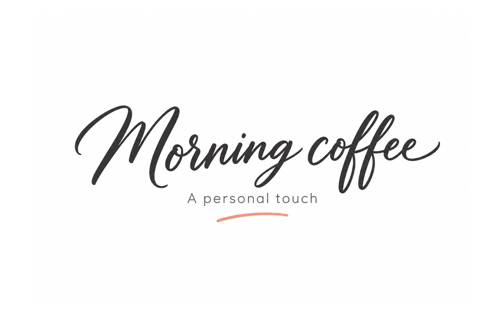
Script typefaces are based on flowing handwriting and calligraphy, with letters that often join together.
They bring elegance or warmth, which makes them popular for logos, invitations and short headlines, like "Morning coffee" on a café sign.
Joined, decorative letters are harder to read in long passages or at small sizes. Pro tip: keep script to a few words and pair it with a plain typeface for everything else.
Slab serif typeface
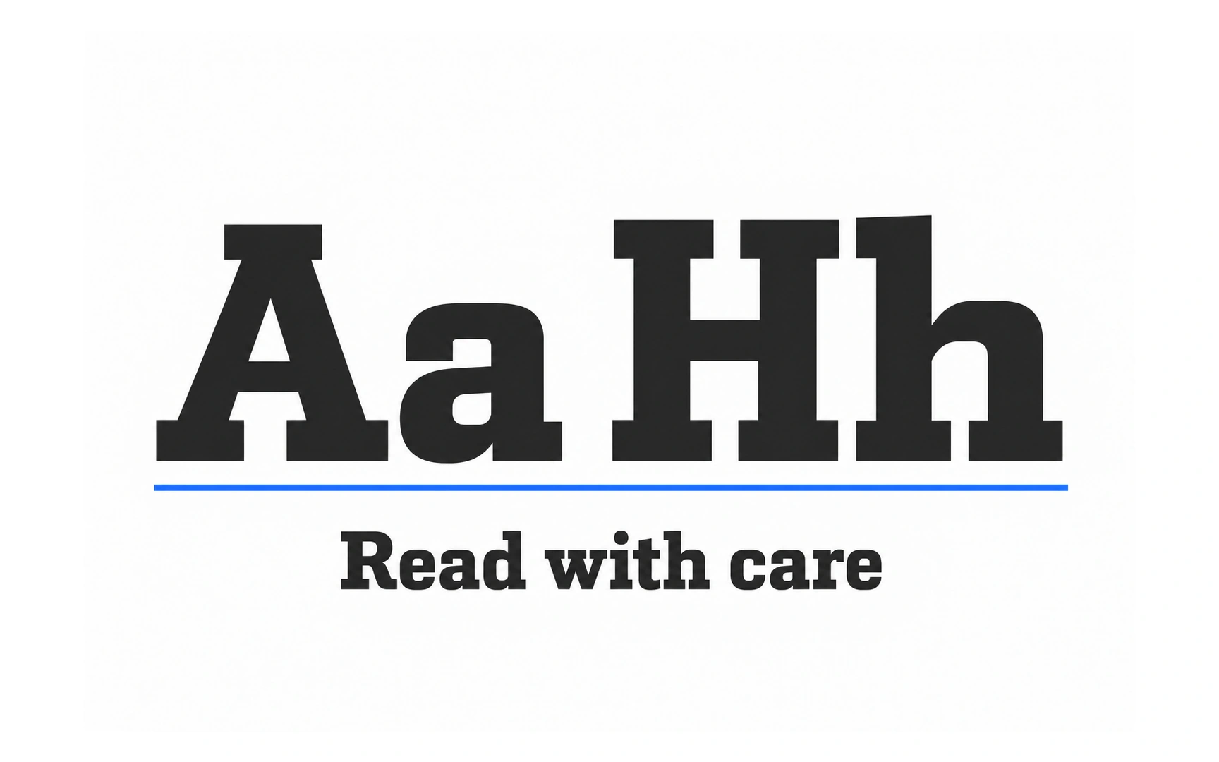
Slab serif typefaces have thick, block-shaped serifs. They first appeared in the early 1800s, when posters and advertisements needed type that could shout from a distance.
Their heavy, sturdy letters feel bold, confident and a little industrial.
That weight makes them great for headlines and short labels but tiring in long text. They can also overpower other typefaces, so pair them with something quiet.
Display typeface
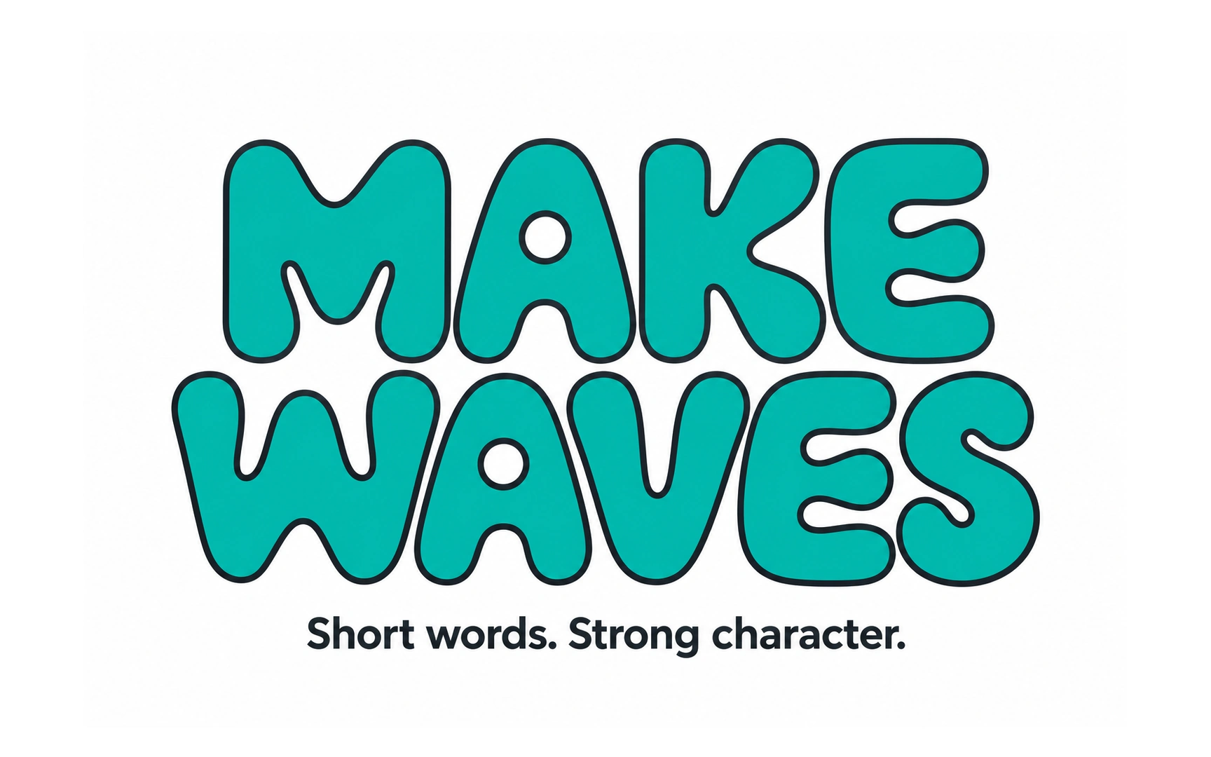
Display typefaces are made to be seen big. They are often playful, dramatic or unusual, like the bold, bubbly "Make waves" sample.
They grew with posters and advertising in the 1800s, when printers wanted letters that stood out on a wall or a shop window.
Use them for a few large words, such as a hero headline or an event poster. At small sizes or in long text, their unusual shapes become hard to read.
Monospaced typeface
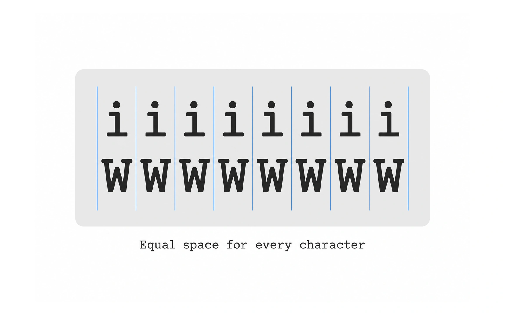
In a monospaced typeface, every character takes up the same width. A narrow i gets as much space as a wide W, just like on a typewriter.
Most typefaces are proportional instead: each letter gets the width it needs, which makes long text flow more naturally.
Equal widths keep characters in neat columns, so monospaced type is the standard for code, tables of numbers and terminal screens. Courier and Space Mono are well-known examples.
Handwriting typeface
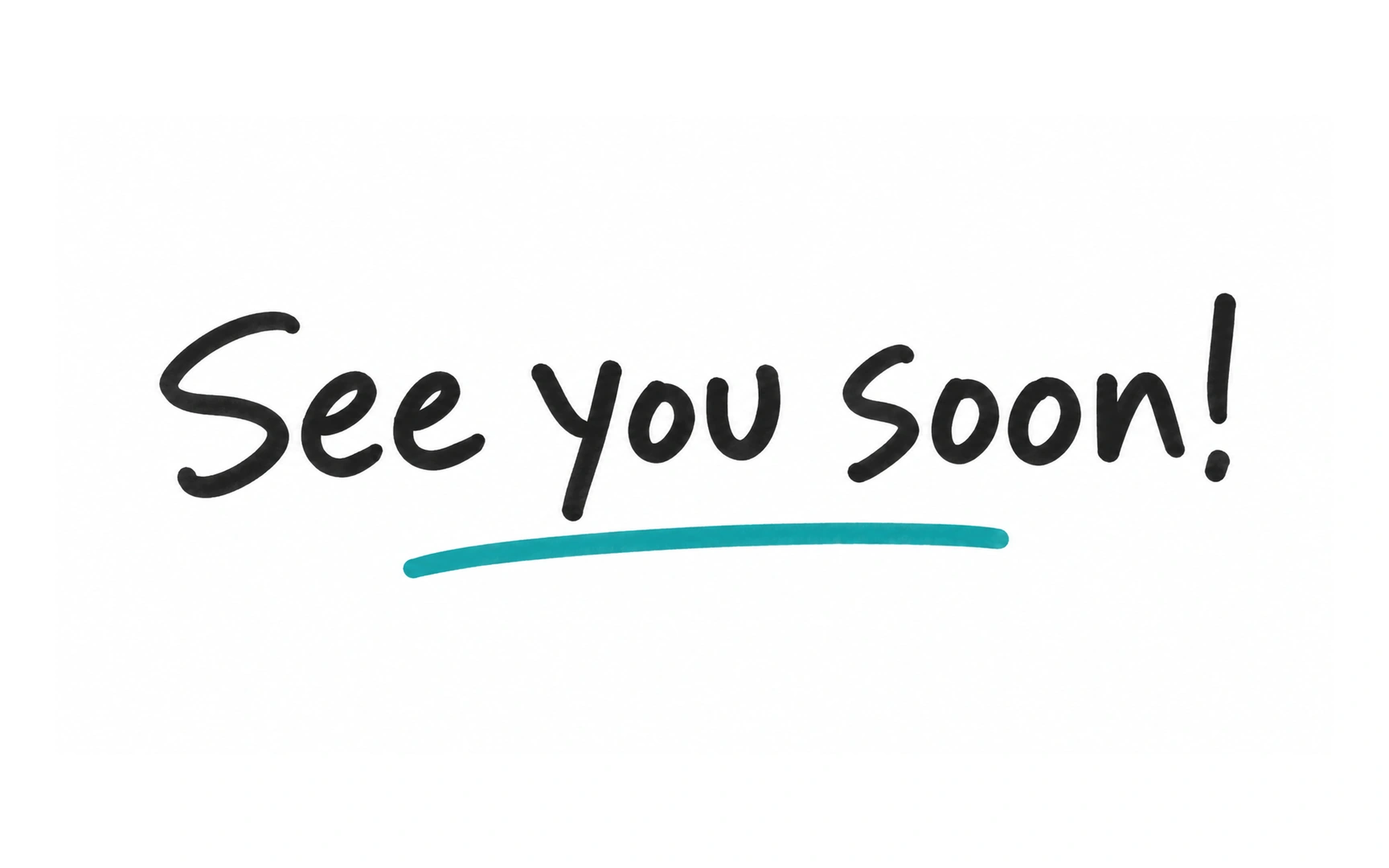
Handwriting typefaces look like everyday handwriting, with uneven, casual letters. They are less formal than script, which imitates calligraphy.
They feel friendly and personal, which suits a sign-off such as "See you soon!" or a handwritten note on a greeting.
Use them sparingly. Pro tip: never set instructions, forms or error messages in a handwriting typeface, because people need to read those quickly and accurately.
Font
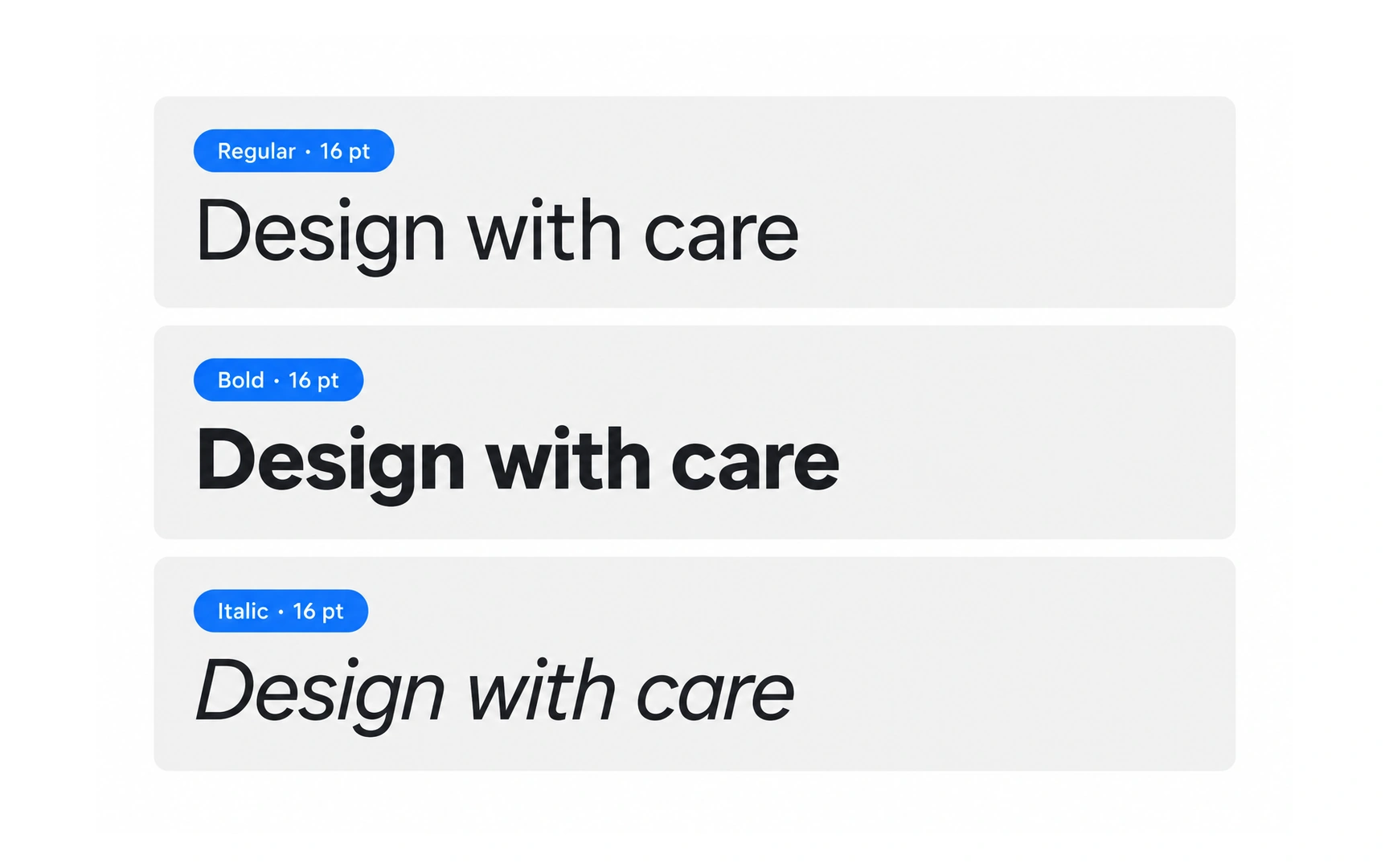
A font is one specific version of a typeface: a particular weight, style and size. Helvetica is a typeface; Helvetica Bold at 12 points is a font.
The word comes from metal printing. Each size and style needed its own set of metal letters, and every single piece of type was called a sort.
Digital type removed that limit: one font file can be shown at any size. Designers still use "font" to mean a specific weight and style, such as Regular, Bold or Italic.
Font weight
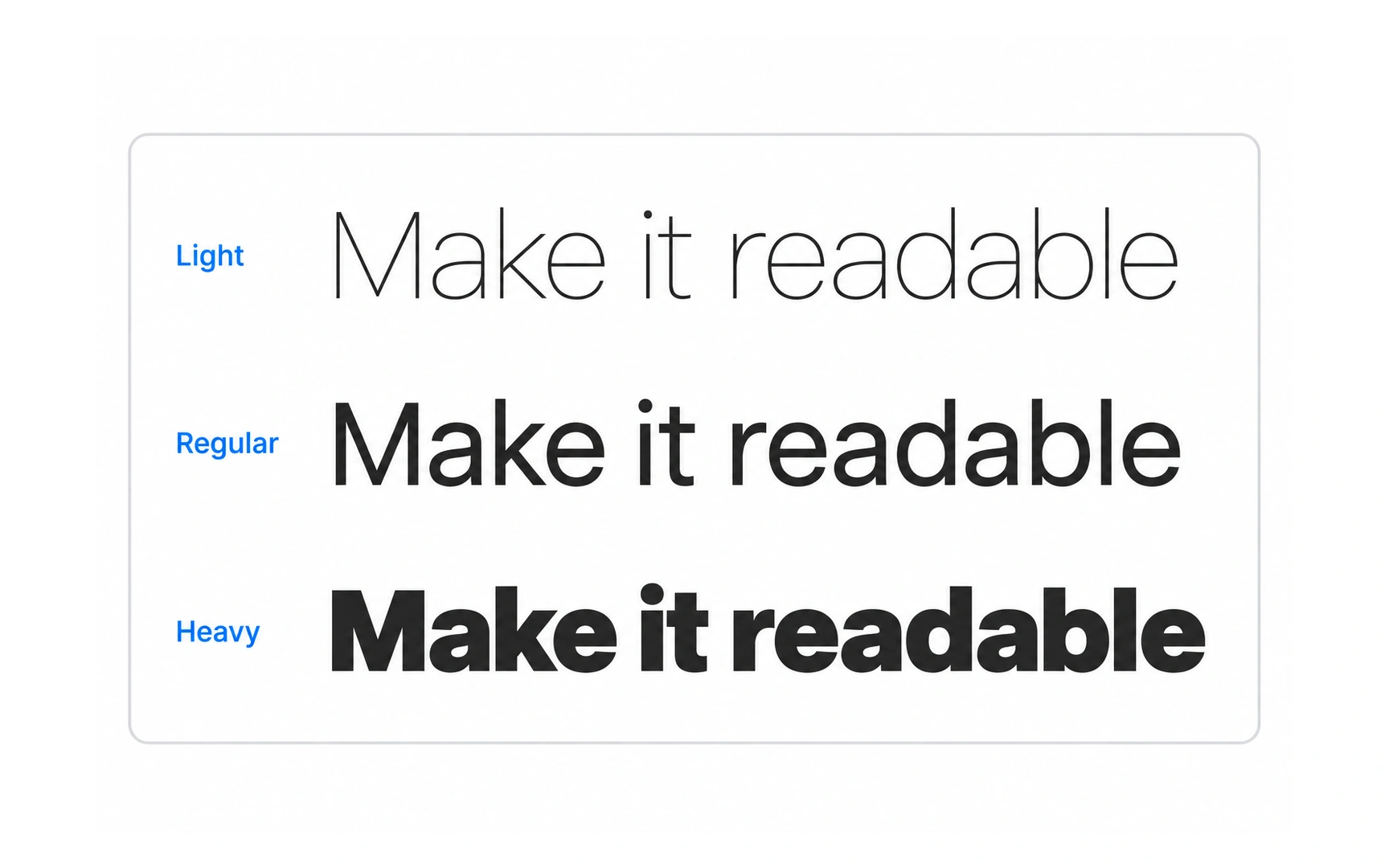
Font weight is how thick the strokes of the letters are, from thin and light to bold and black.
In CSS, weights are numbers from 100 to 900. 400 is regular and 700 is bold; many typefaces include only some of the weights in between.
Weight is one of the easiest ways to show what matters most. Pro tip: use a heavier weight for headings and a regular weight for body text, and limit yourself to two or three weights per screen.
Common font styles
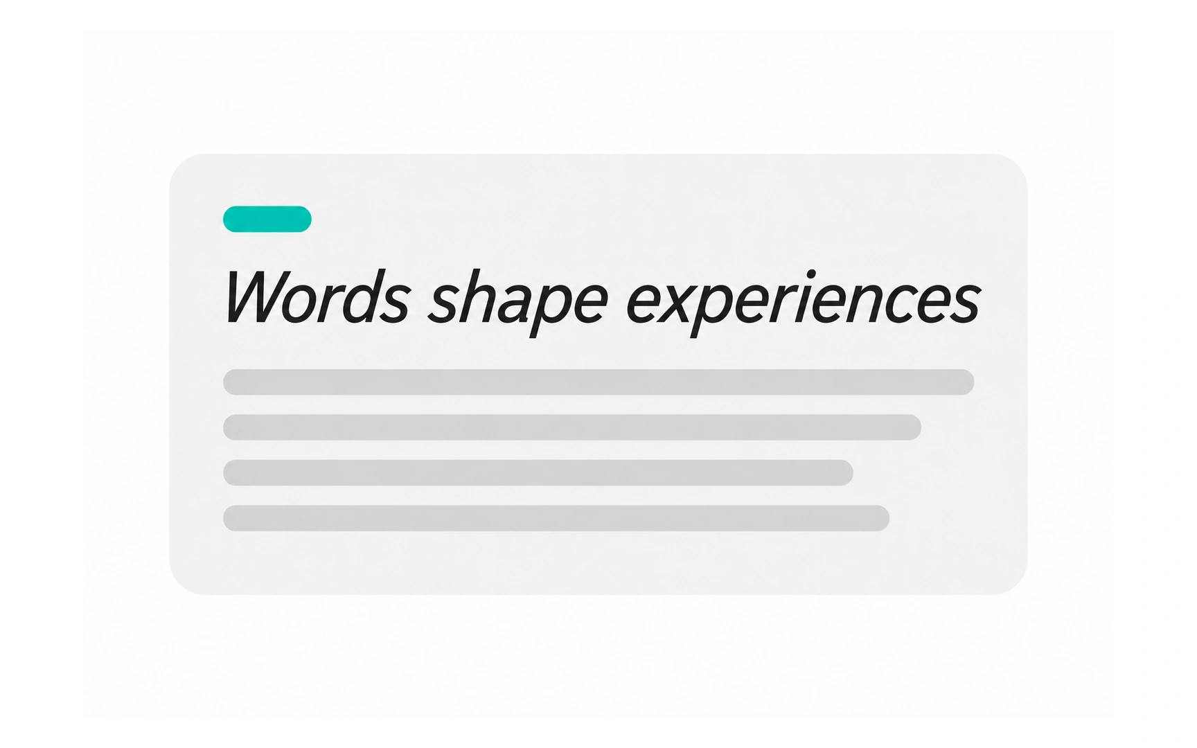
Regular is the everyday style of a typeface. It is the most comfortable for long reading, which makes it the default for body text.
Bold uses thicker strokes to add emphasis. It is the usual choice for headings, because it builds a clear hierarchy at a glance.
Italic slants the letters to the right. It suits light emphasis inside a sentence and titles of books or films, but an italic heading looks weaker than a bold one, as the comparison shows.
System and web fonts
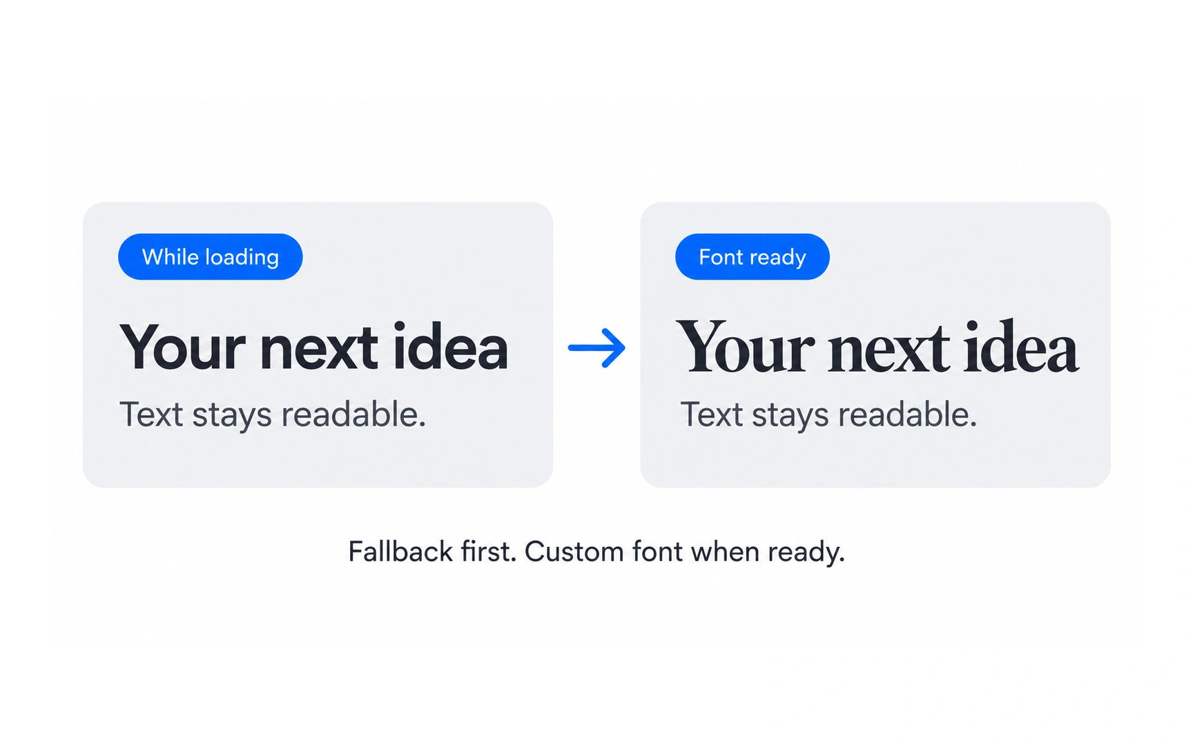
System fonts are already installed on a device, so they appear instantly and need no download. Arial, Helvetica and Georgia are common examples.
Web fonts are downloaded by the browser when a page opens, using the CSS @font-face rule. Today they are usually WOFF2 files, a compressed format made for the web. They let a brand use its own typeface everywhere.
The trade-off is speed. Pro tip: always name a system font as a fallback, so text stays readable while the web font loads or if it fails, as the before-and-after shows.
TOPICS
FROM COURSE