Motion Basics: Timing and Easing
Learn how timelines, keyframes, duration, delay and easing make interface motion feel natural.
Motion tells people what just happened and what is happening now. This lesson covers the building blocks of an animation, a timeline, keyframes, duration and delay, and the timing curves that decide whether movement feels mechanical, natural or playful.
Animation
An animation is a quick run of still frames that our eyes read as continuous movement. In an interface, its main job is to show what the system is doing and to confirm what the user just did.
Interface animations usually start for one of two reasons:
- The user acts. Someone taps Pay, and a spinner confirms the payment is being processed.
- The system changes. A file finishes uploading, and a checkmark animates in to show it is done.
Used with care, motion makes a product feel responsive and easier to follow. Too much of it gets in the way: extra movement can distract, slow people down and even make some people feel unwell.
Animation timeline
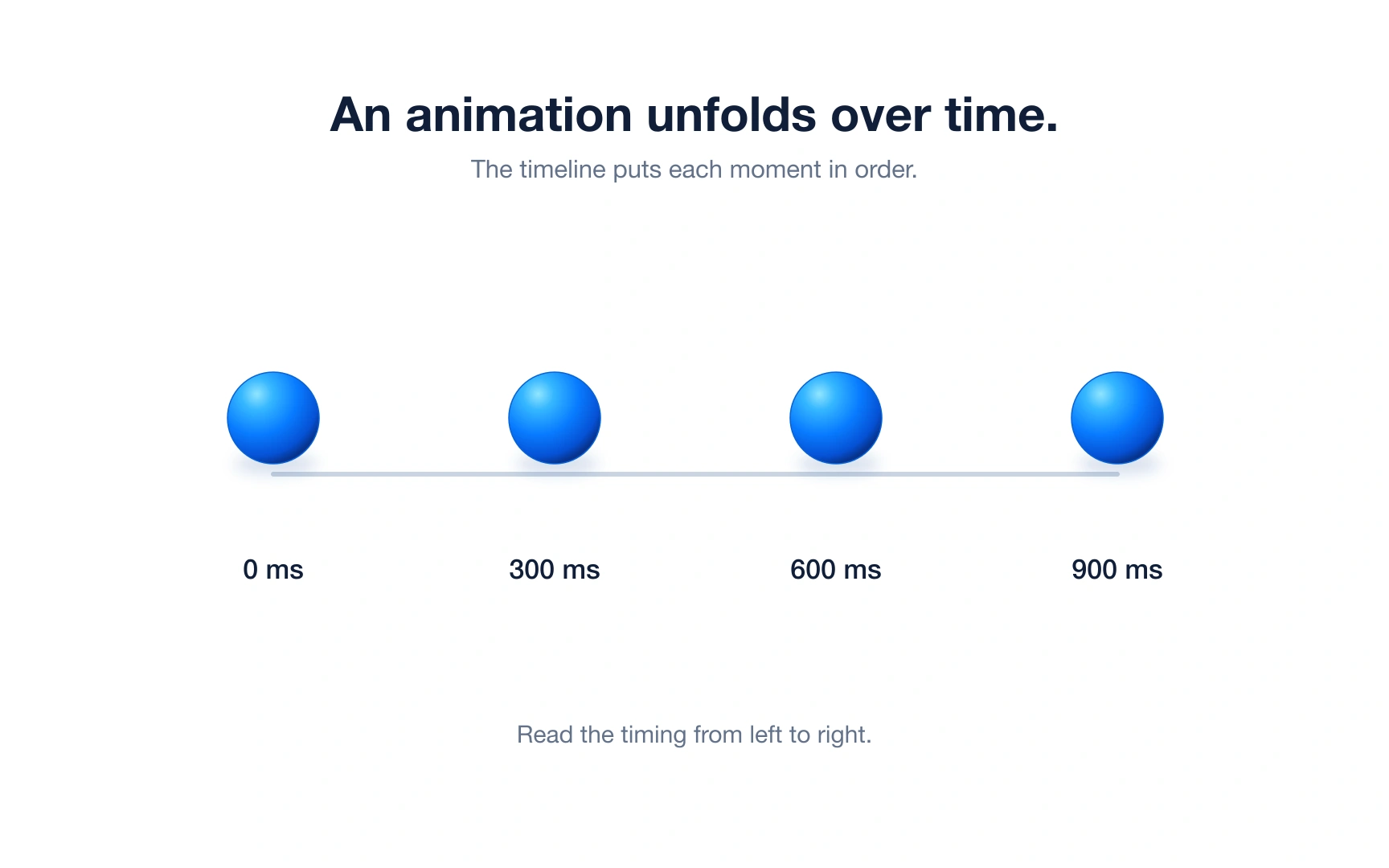
A timeline is where an animation is planned. It lays time out from left to right, usually in milliseconds (ms), so you can see what happens at each moment.
In the example, the same sphere is shown at 0, 300, 600 and 900 ms. Reading left to right tells you the order of events and how long the whole animation lasts.
Animation tools such as After Effects, Figma and Rive stack several tracks on one timeline, one for each element or property, so a button can change color while a card slides in.
Animation keyframes
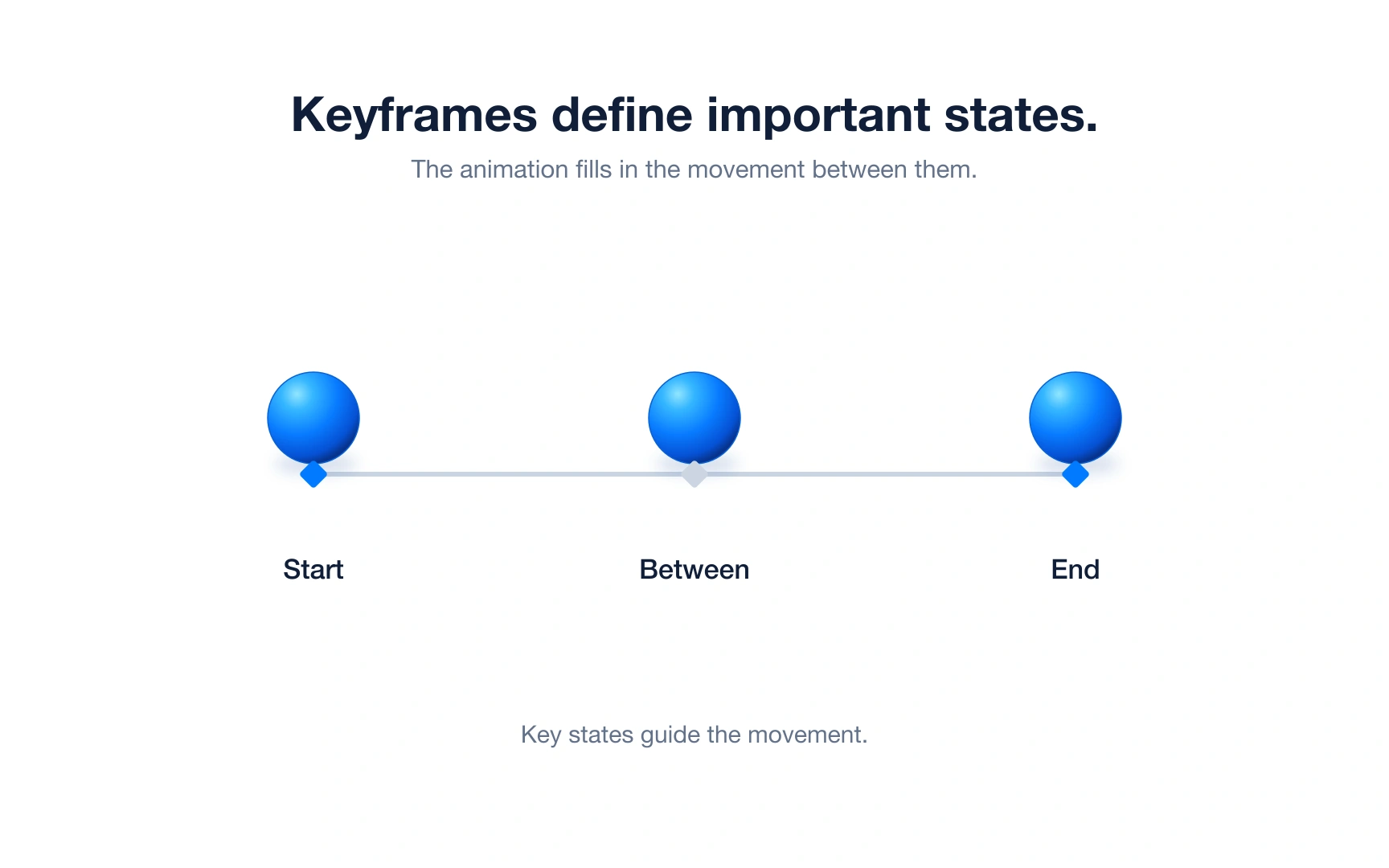
A keyframe marks a moment where you decide exactly how an element should look: its position, size, color or opacity. On most timelines keyframes appear as small diamonds.
You usually set only the important moments, such as a start and an end. The tool fills in every frame between them. This is called interpolation, or "tweening".
Example: to make a Like button pop, set a keyframe at normal size, one slightly larger and one back at normal size. Three keyframes are enough for a smooth effect.
Animation duration
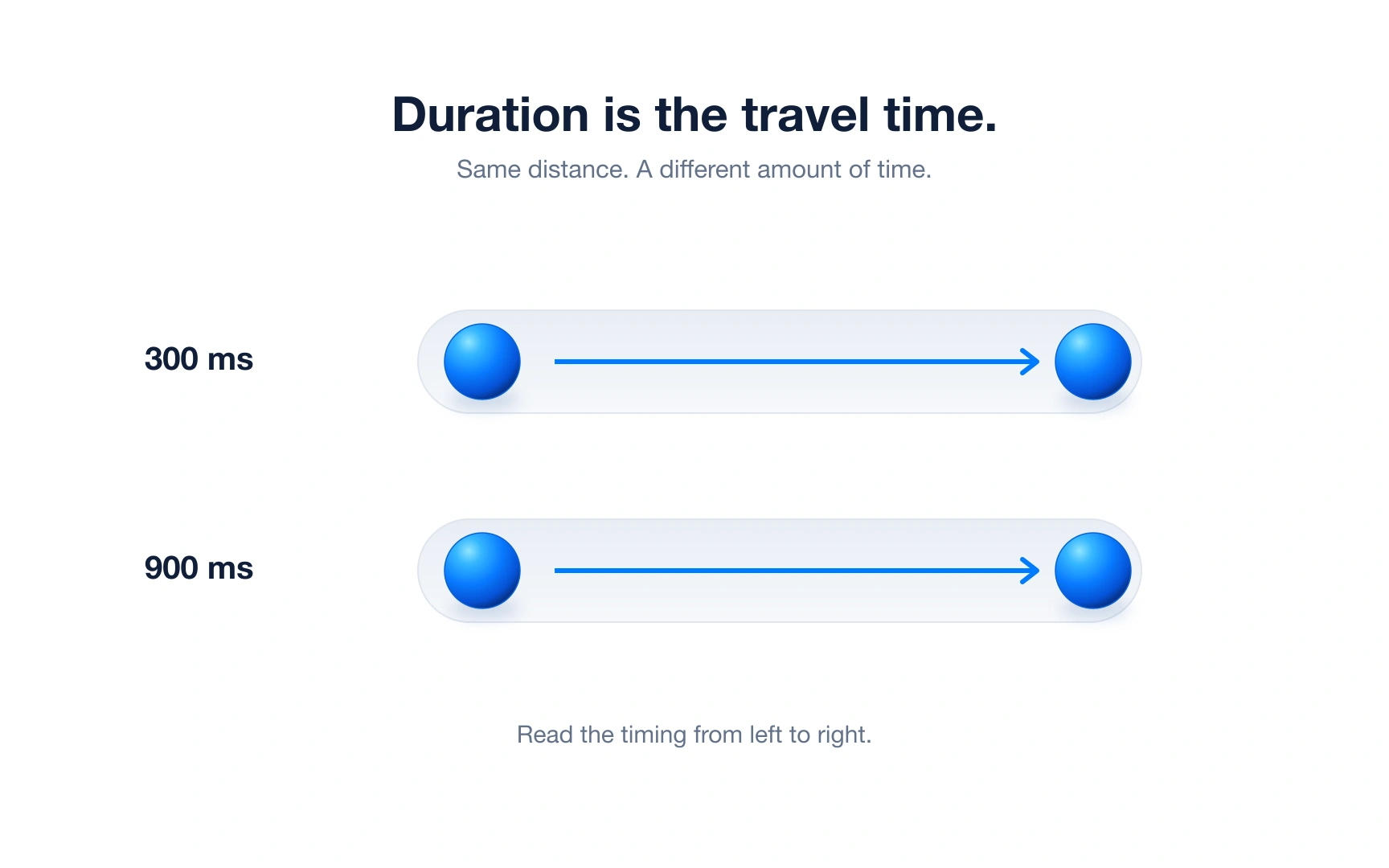
Duration is how long an animation takes from start to finish. In the example, both spheres travel the same distance, but one takes 300 ms and the other 900 ms, so the second feels much slower.
A good starting point for most interface animations is about 100 to 500 ms. Shorter than that and people may miss the change; longer and they end up waiting for the interface.
Match the duration to the size of the change, then test it. As a rough guide, a checkbox tick can take around 100 ms, while a panel sliding across the screen may need closer to 300–400 ms. Pro tip: if a motion feels slow, try making it shorter before changing anything else.
Animation delay
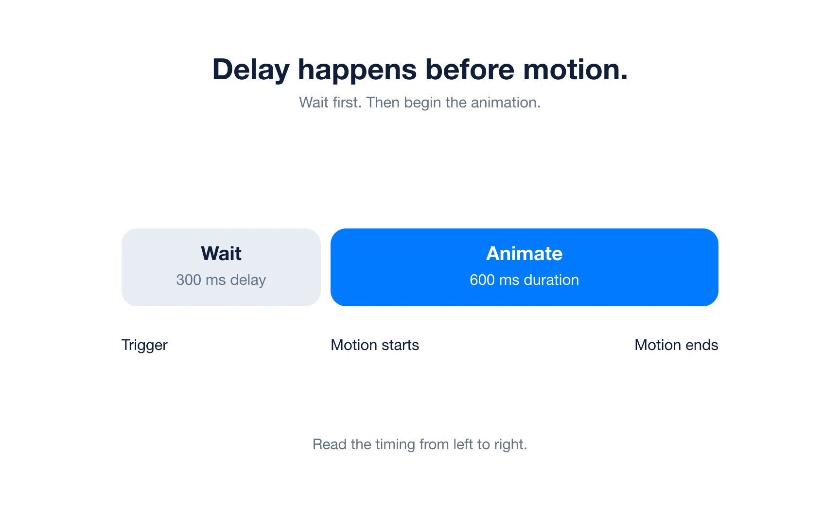
Delay is the pause between a trigger, such as a tap or a page load, and the start of the motion. In the example, the sphere waits 300 ms and then moves for 600 ms.
With no delay, motion starts right away, which is what most feedback needs. Small delays are useful for staggering: in a list, each card can appear 50 ms after the one before it, so the eye follows the order.
A negative delay starts the animation part-way through, as if it was already moving. Use delays sparingly: unnecessary delays can make feedback feel slow.
Linear timing function
A timing function controls how speed changes during an animation. The simplest is linear: the element moves at the same speed from start to finish.
Real objects rarely move like that. They need time to speed up and slow down, so linear movement can look stiff and robotic.
Linear still has good uses: color and opacity fades, progress bars and loading spinners, where a steady rate is exactly what you want.
Easing timing function
Easing lets an animation change speed as it plays, the way a bike builds up speed and then brakes. This makes digital movement feel more physical and natural.
In the example, both spheres cover the same distance in the same time. The linear one keeps a steady pace, while the eased one starts faster and settles gently at the end.
There are three common easing curves: ease-in, ease-out and ease-in-out. The next sections look at each one.
Ease-in curve
An ease-in curve starts slowly and speeds up toward the end, like a sprinter pushing off the blocks.
Because it ends at full speed, the stop can feel abrupt if the element stays on screen. Ease-in works best for elements that are leaving, such as a dismissed toast sliding out of view.
In CSS this curve is called ease-in. Keep exits short; around 150–200 ms is a good starting point, because people rarely need to watch something leave.
Ease-out curve
An ease-out curve is the reverse of ease-in: it starts fast and slows down as it arrives, like a car pulling up gently at a stop sign.
Because it responds quickly and lands softly, ease-out is the usual choice for elements entering the screen, such as a menu opening or a dialog appearing.
Entrances can take a little longer than exits, often around 200–300 ms as a starting point, because people need to see where the new element lands.
Ease-in-out curve
An ease-in-out curve starts slowly, speeds up in the middle and slows again before it stops. It suits elements that move from one place to another while staying on screen.
The two halves do not need to match. Google’s Material Design suggests speeding up quickly and taking longer to slow down, which makes movement feel responsive and smooth.
Not everything moves smoothly in real life, though. The last two motion types, spring and bounce, add some playful physics.
Spring animation
A spring animation behaves like a real spring. The spring shown here overshoots its target, swings back and forth a little less each time, and then settles. With more damping, a spring can settle without overshooting at all.
An overshoot gives motion a lively, physical feel. It works well for small, friendly moments, such as a toggle snapping into place or a card dropped after dragging.
Keep springs subtle. A big wobble on an important control can look unstable and slow people down.
Bounce animation
A bounce animation copies a ball dropped on the floor. The element hits a hard stop, rebounds, and each bounce is lower than the one before until it comes to rest.
Unlike the spring shown earlier, a bounce never goes past its target. The floor is a limit the element cannot cross.
Bounces are playful, so save them for light moments, such as a reward badge dropping into view, rather than everyday controls.
REFERENCES
TOPICS
FROM COURSE