

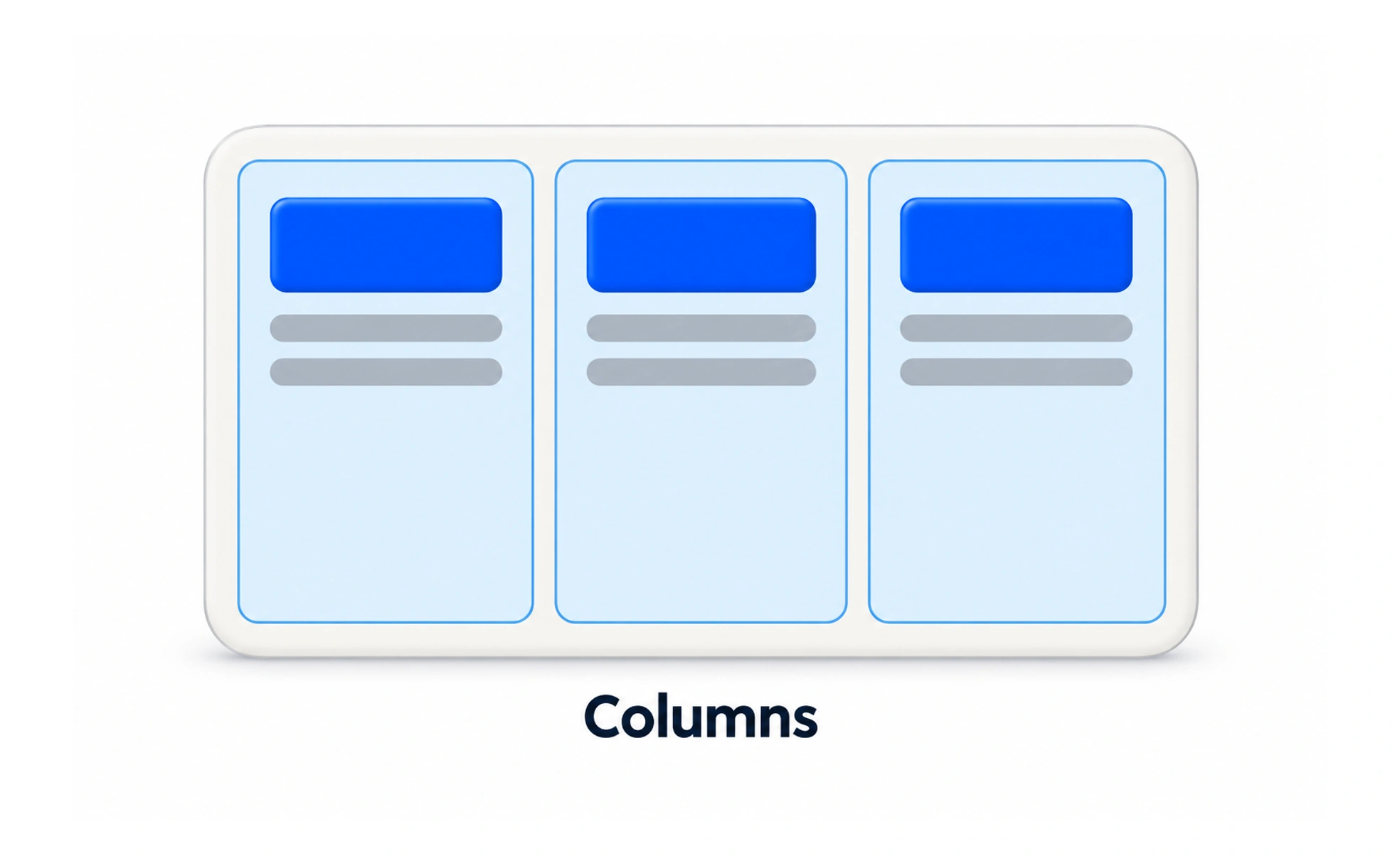
A column layout can establish hierarchy, align information, and make efficient use of wide screens. It must also adapt to narrow screens and different reading or zoom settings without hiding relationships or creating awkward horizontal scrolling.
A newspaper uses columns to organize stories across a broad page; a digital layout uses columns to give content a clear structure.
Choose columns for the content
Columns work well when items have a meaningful relationship, such as a form beside help text or a comparison of a few plans. A grid chosen only to fill space can make scanning harder. Keep related labels, values, and controls close enough that their connection remains clear.
Control reading order
Visual placement should agree with the order people encounter content by keyboard and assistive technology. When columns stack on a small screen, the sequence should still make sense. Avoid using CSS placement to create a visual order that conflicts with the document’s logical order.
Balance line length and spacing
Very wide text columns can make reading tiring, while narrow columns create too many line breaks. Set a readable content width, give columns enough separation, and let gaps respond to screen size. Dense data tables may need a different strategy from prose or cards.
Adapt without losing content
At smaller widths, stack, reflow, or intentionally scroll the layout based on its purpose. Test zoom, translated text, and long labels as well as common device widths. A responsive design should preserve all content and actions rather than simply shrink desktop columns.
Frequently asked questions
Key takeaways
- Use columns to express meaningful relationships and hierarchy.
- Keep visual order consistent with reading and focus order.
- Choose widths that support comfortable reading and scanning.
- Test reflow with zoom, long text, and narrow viewports.