

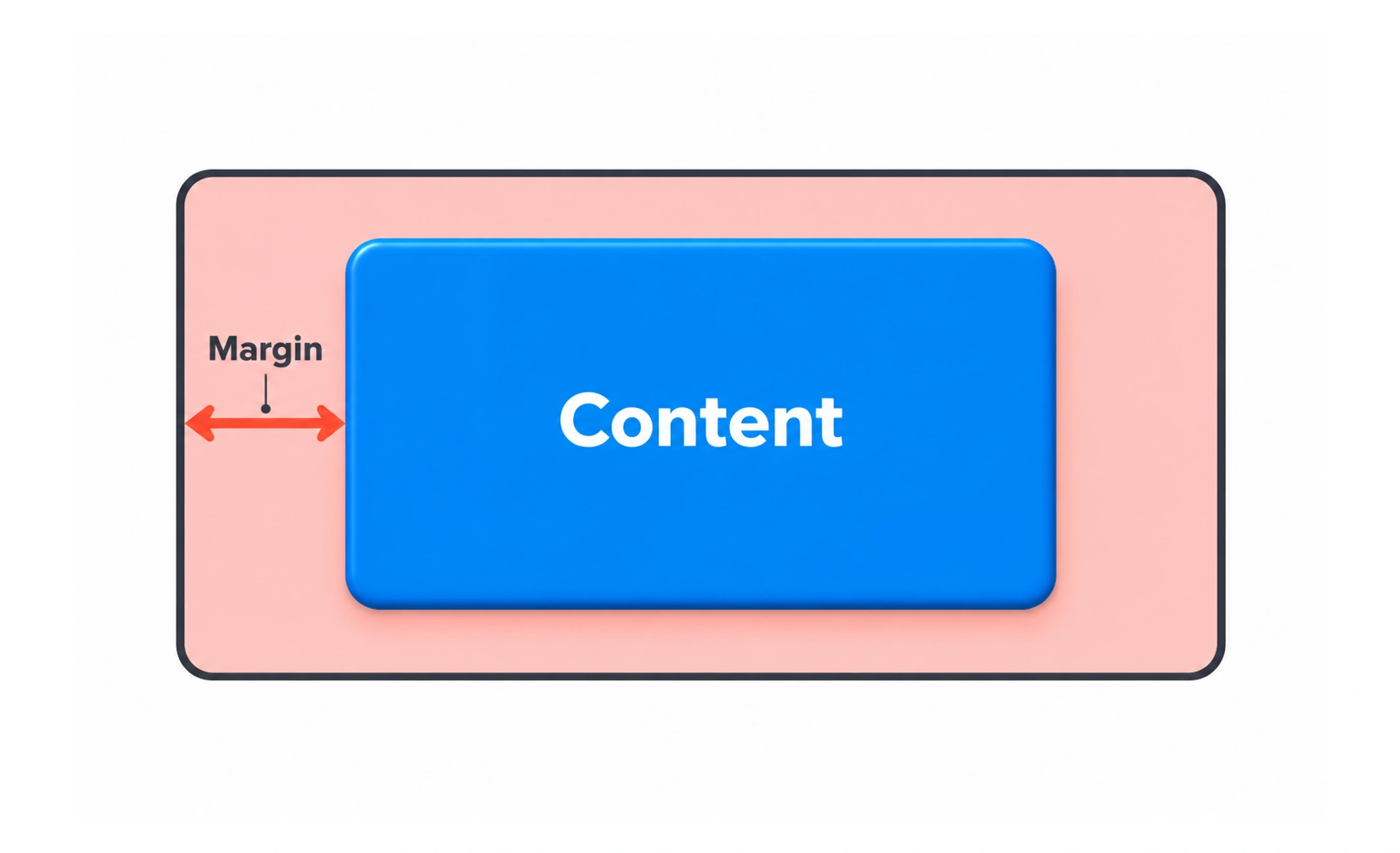
A margin is space outside an element that separates it from neighboring content. In interface design, outer spacing helps define grouping, rhythm and page boundaries.
Margins are the breathing room around a framed picture; they separate it from nearby objects without changing the picture itself.
Use outer space to show grouping
A larger gap between sections and a smaller gap within a section help people see which items belong together. Establish a spacing scale and use it consistently. Repeated, meaningful spacing is easier to maintain than unrelated values chosen for each component.
Separate component space from layout space
A component can define its internal padding, while its parent controls separation from siblings. Keeping these responsibilities clear prevents double spacing when components are reused. In CSS, margins may collapse in some block layouts; gap or parent padding can make spacing behavior more predictable.
Let page margins adapt
Content needs enough room from the viewport edge, especially on small screens, but a fixed outer margin can waste space on a phone or feel too narrow on a large display. Use responsive page gutters and a readable content-width limit rather than stretching paragraphs across the entire screen.
Example: article sections
An article may use a modest gap between a heading and its paragraph, a larger gap between sections, and a consistent page gutter. If every element receives its own bottom margin, spacing can accumulate unpredictably. A section-level rhythm makes the page easier to tune and reduces layout exceptions.
Frequently asked questions
Key takeaways
- Use larger outer gaps to distinguish sections.
- Give parent layouts and reusable components clear spacing roles.
- Use responsive page gutters and readable content widths.
- Prefer a consistent spacing scale over one-off values.