

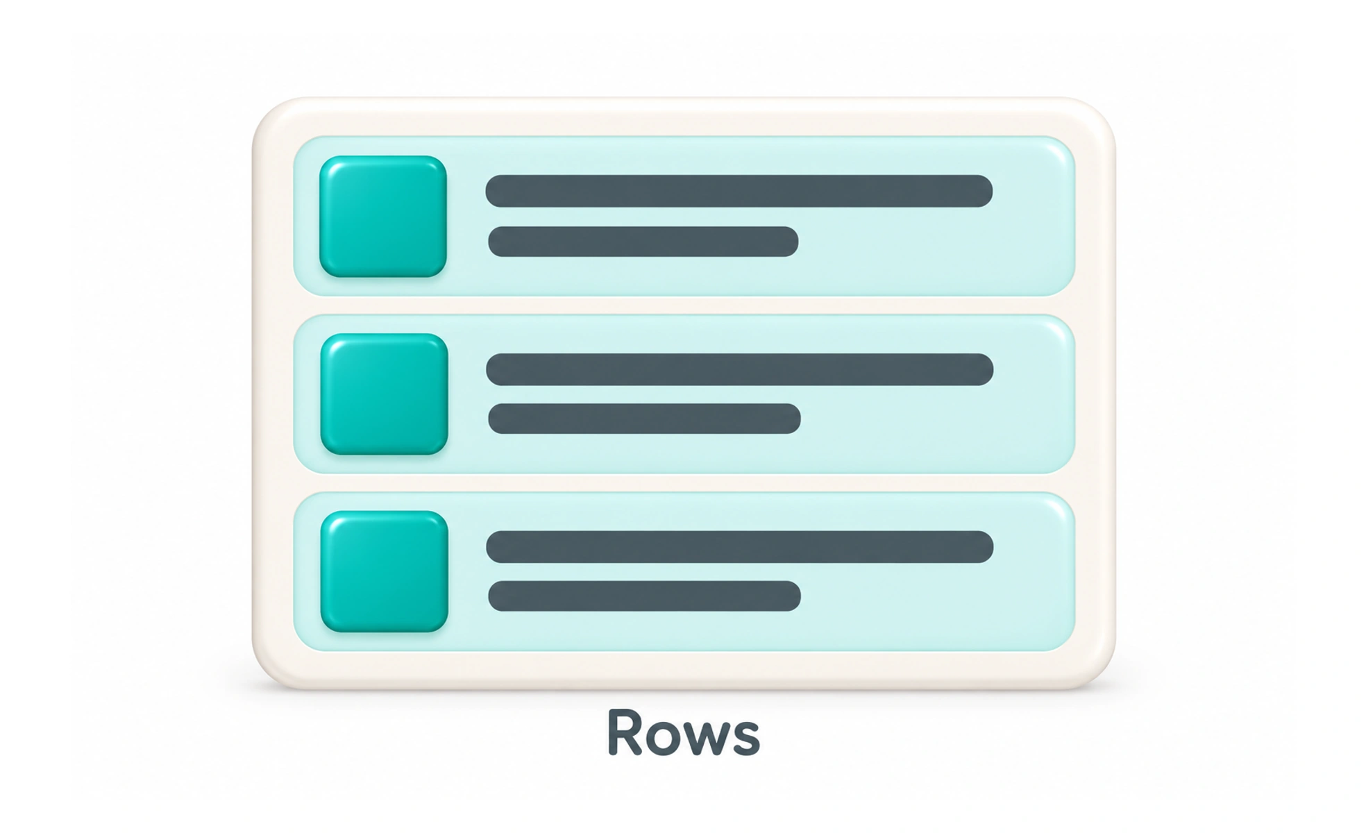
Rows appear in lists, tables, settings, and navigation. Their structure should help people understand which values belong together and what action applies to them. A row may adapt or stack on narrow screens, but it should preserve that relationship when it changes shape.
A row is like one labeled line in a ledger: the columns help you see which values describe the same entry.
Make interaction scope clear
If the whole row opens a detail page, communicate that behavior and ensure nested buttons still work independently. If only one control is actionable, do not make the remaining row appear clickable. Provide hover, focus, and selected states that explain which item is active.
Adapt to content and viewport
Rows should tolerate longer names, translated labels, and missing values. At smaller widths, hide only secondary information or reorganize the content into a readable stack. Preserve the primary value and action, and avoid horizontal scrolling when a responsive arrangement can work.
Support scanning and assistive technology
Use consistent spacing and predictable ordering so repeated rows can be compared. In data tables, expose correct row and column headers; in ordinary lists, use semantic list structure. Ensure keyboard users can reach each action without tabbing through decorative elements.
Frequently asked questions
Key takeaways
- Group only information that belongs to the same item or task.
- Make row-level and nested interaction behavior distinct.
- Handle long content and narrow layouts without losing key meaning.
- Use semantic table or list structure for the information presented.