

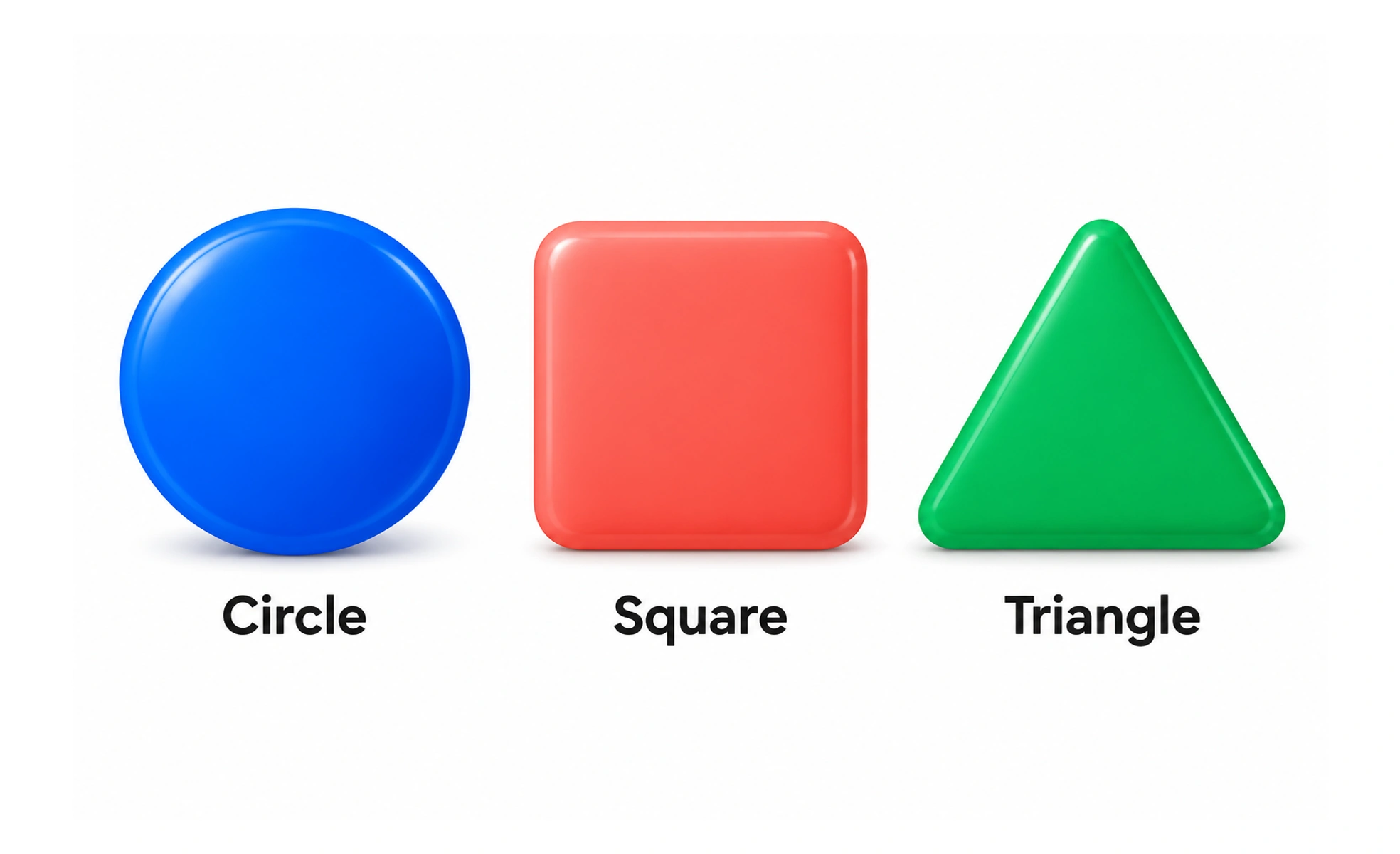
Basic shapes are simple geometric forms such as circles, rectangles and triangles. Designers use them to build components, organize information and create visual emphasis.
A few simple blocks can form a clear sign or diagram when their relationships are arranged thoughtfully.
Let shape support meaning
A circle can suggest a status point or avatar; a rectangle can frame a content area. These conventions are not universal, so use context and labels when meaning matters. Do not choose a shape only because it is visually fashionable if it makes the control harder to recognize.
Build a coherent component language
Set consistent corner radii, border treatments and proportions for related components. Distinct shapes can help separate categories, but too many unrelated forms make a page feel fragmented. Reuse a small set of shapes and vary them only when the function or hierarchy requires it.
Check perception and accessibility
Shape alone should not communicate a critical state when color or text can clarify it. Consider contrast, size and whether a shape remains distinguishable at small scale. For charts and diagrams, include labels or a textual explanation so the information is not trapped in geometry.
Example: progress indicator
A rounded bar can show how much of a task is complete, while a label gives the exact state. If the bar changes only color, some people may miss the change. Pair geometry with text or another visible cue and make sure its proportions remain clear on narrow screens.
Frequently asked questions
Key takeaways
- Use shapes to support structure and recognizable meaning.
- Keep component geometry coherent across a product.
- Do not encode critical states through shape or color alone.
- Label diagrams and indicators with meaningful text.