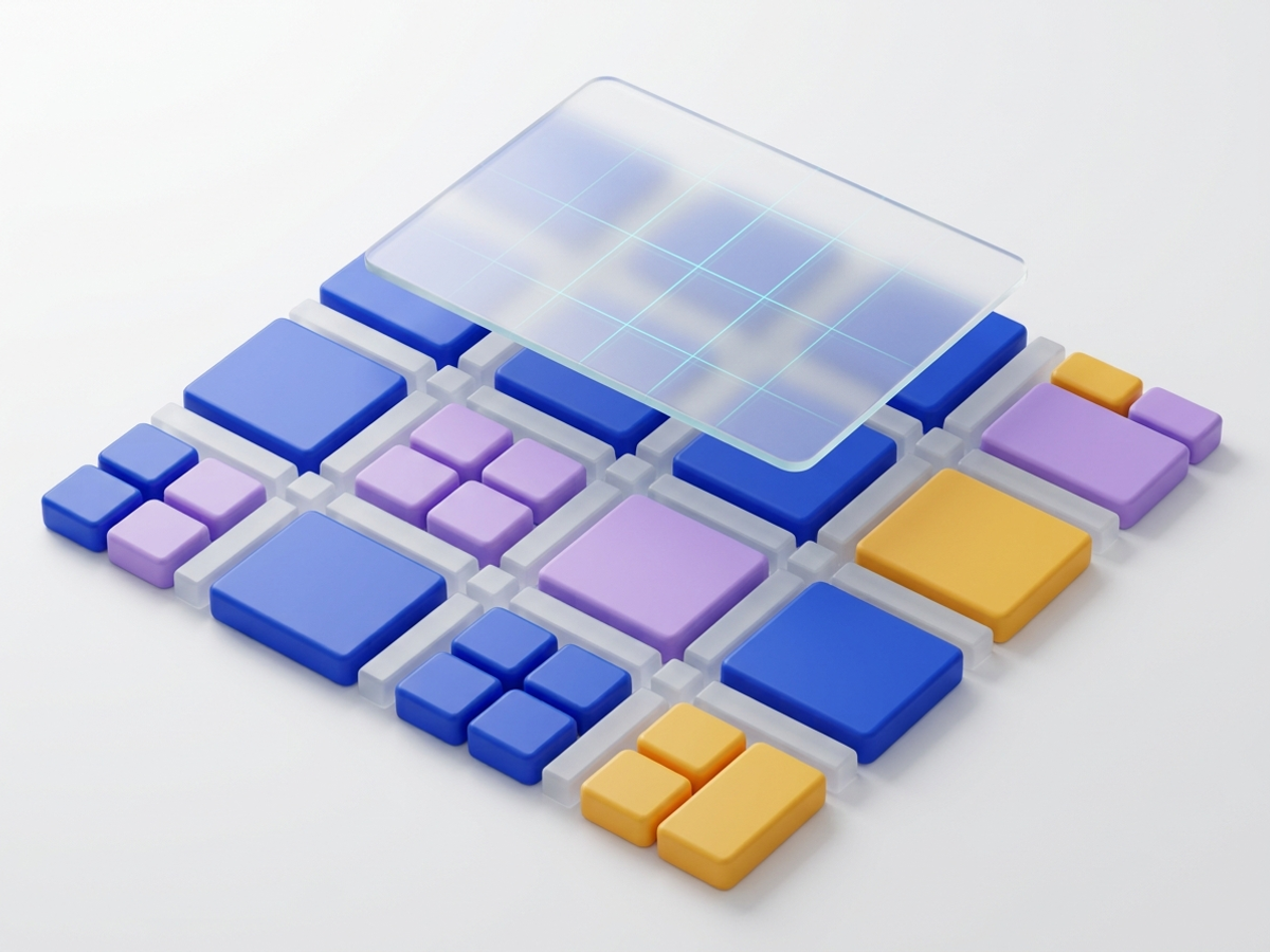
Inconsistent spacing is the fastest way to make software look amateur. An 8-point spatial grid system replaces arbitrary pixel guessing with a predictable mathematical cadence shared across design and engineering.
The Problem with Arbitrary Spacing Decisions
When design teams lack a systematic spacing scale, interfaces rapidly decay into visual chaos: - One designer uses 15px padding, another uses 18px, and a developer implements 20px. - Small spacing discrepancies accumulate across screen containers, causing misaligned card edges and awkward visual rhythm. - Sprints bog down in subjective debates over whether an element needs 2px more or less margin.
The Mathematics of 8pt: Hardware Scaling and Sub-Pixels
Why 8 pixels instead of 5px or 10px? The reason lies in digital screen hardware architecture: - Popular screen resolutions (such as 1080p, 1440p, 4K, and smartphone Retina displays) scale cleanly by multiples of 8. - Dividing 8px by 2 (or 1.5x) yields clean integers (4px), preventing blurry fractional sub-pixel rendering. - An 8pt scale provides just enough granularity without overwhelming choices: $$ ext{Scale} = {4, 8, 16, 24, 32, 40, 48, 64, 80, 96px}$$
Micro vs. Macro Spacing Tokens in Tailwind and CSS
Organize spatial tokens into clear operational layers: 1. Micro-Spacing (4px, 8px, 12px): Used for internal component anatomy. Spacing between an icon and its text label (8px), or between an input label and its text field (4px). 2. Component Padding (16px, 24px): Internal padding for cards, modals, and list items. 3. Macro-Spacing (32px, 48px, 64px+): Spacing between major layout sections, page headers, and grid columns.
Aligning Typography to the 4pt/8pt Baseline Grid
To achieve cohesive vertical rhythm, typographic line-heights must snap to the 4pt or 8pt grid: - 14px body text set to 20px line-height (5 grid units of 4px). - 16px body text set to 24px line-height (3 grid units of 8px). - 24px heading text set to 32px line-height (4 grid units of 8px). When line-heights snap to the spatial scale, adjacent columns of text align perfectly across horizontal baselines.
Key takeaways
- The 8-point system eliminates spacing guesswork across design and engineering teams.
- Multiples of 8px align cleanly with hardware display scaling, avoiding sub-pixel blur.
- A 4px sub-grid provides fine-grained control for tight icon and label spacing.
- Snapping typographic line-heights to 4px/8px maintains flawless vertical baseline rhythm.