Image Terminology
Learn the kinds of images interfaces use, from photos and illustrations to thumbnails, avatars, icons and emojis, and what each one is for.
Interfaces use many kinds of images, and each kind has a job. A photo shows something real, a thumbnail helps people browse, an avatar stands in for a person. Knowing the names helps you choose the right image for the task and talk about it clearly with your team.
Photograph

A photograph captures a real scene, person or object, like the rocky ground shown here. Because it is real, a photo tells people "this exists and looks like this".
That makes photos ideal when accuracy matters: products in a shop, places on a travel site, people in a news story. They can also set a mood and help people feel something about a brand.
Pro tip: choose photos that show what people need to see, not just what looks nice. A clear product photo helps shoppers decide; a moody but vague one does not.
Illustration

An illustration is an image made by an artist, by drawing, painting or digital tools. It is "created to communicate", like the pen and origami bird shown here.
Illustrations can show ideas that are hard to photograph, such as a concept, a feeling or a product that does not exist yet. They can also make dense content friendlier.
A consistent illustration style becomes part of a brand. Pro tip: use one style across a product, so illustrations feel like they come from the same place.
Image placeholder

An image placeholder marks where an image will go before the real one is ready. A gray box with a simple mountain-and-sun symbol is the most familiar version.
Designers use placeholders in wireframes and early prototypes, so the layout can be judged before final images exist. Apps also show them while real images are still loading.
Keep the placeholder the same size and shape as the final image, so the page does not jump when the real image arrives.
Hero image

A hero image is a large image at the top of a page, often with a short headline and a button. In the example, big headphones sit beside "Hear every detail".
It is the first thing visitors see, so it sets the tone and tells them what the page is about at a glance.
Pick a hero image that supports the headline and loads quickly. Pro tip: make sure any text over the image stays readable on every screen size.
Thumbnail image

A thumbnail is a small preview of a larger image or video. A grid of thumbnails lets people browse many items at once, as in "Small previews. Easy browsing."
Selecting a thumbnail usually opens the full image, a product page or a video.
Pro tip: create real small image files for thumbnails instead of shrinking full-size images in the browser. Smaller files load faster, especially in large galleries.
Lightbox
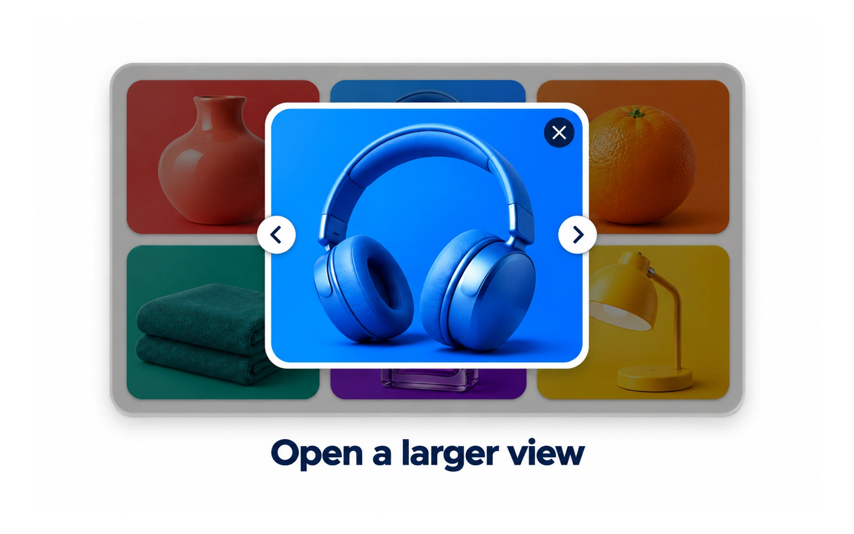
A lightbox shows a larger version of an image on top of the page, while the page behind is dimmed. It lets people look closely without leaving where they were.
When there are several images, add clear next and previous arrows, as in the example, so people can move through the set.
Always include an obvious way to close the lightbox, and let people close it with the Escape key too.
Profile picture

A profile picture is the photo a person chooses to represent their account, usually a picture of their face.
It appears next to their name on profiles, posts and comments, like Maya Chen’s photo in the example. Seeing a face helps people recognize who they are talking to.
Profile pictures are often shown as circles, which crop neatly around a face and look consistent across a page.
Avatar
An avatar is any image that represents a person or account on screen. A profile picture is one kind of avatar.
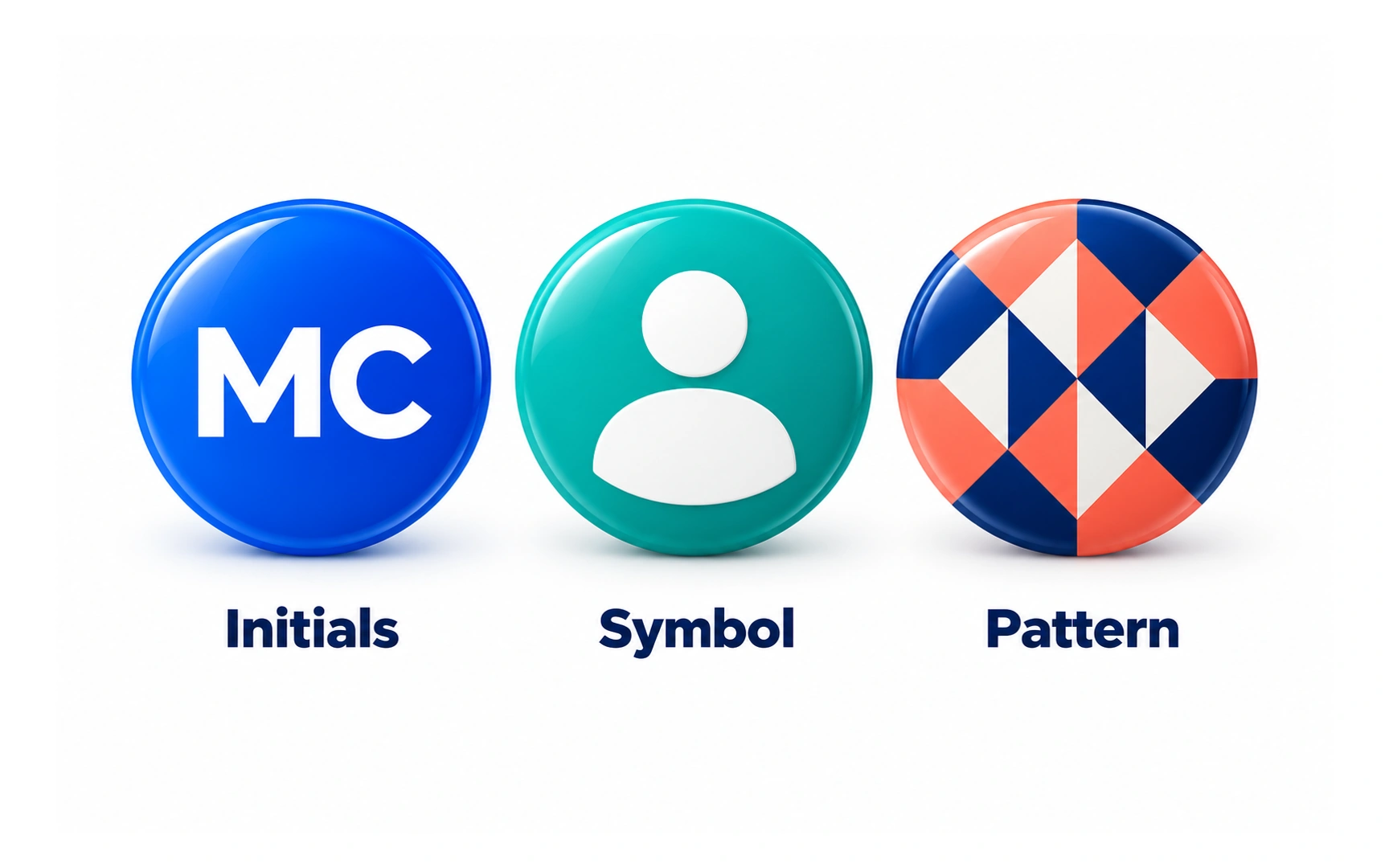
When someone has not added a photo, products show a default avatar instead: their initials, a person symbol or a generated pattern, like the three examples here.
Default avatars keep comment threads and member lists easy to scan. Pro tip: give each person a different color or pattern, so people can tell accounts apart at a glance.
Icons

Icons are small, simple symbols for actions, objects or places, such as a magnifying glass for Search, a bookmark for Save and a bell for Alerts.
Good icons are recognized at a glance and save space. They work best when they follow familiar conventions.
Some icons mean different things to different people. Pro tip: add a short text label when an icon’s meaning might be unclear.
Emojis
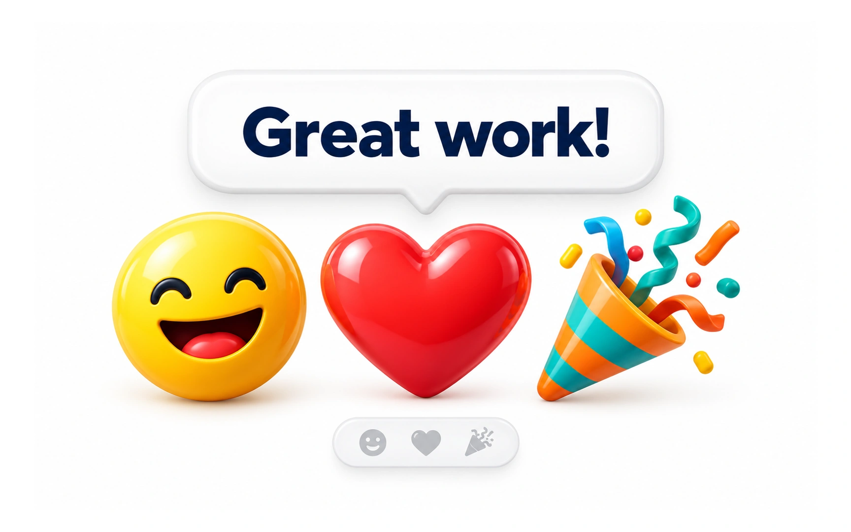
Emojis are small, colorful pictures that add feeling to text, like the smile, heart and party popper after "Great work!".
The word comes from Japanese: e means picture and moji means character. Despite how it sounds, it is not related to the English word "emotion". Emojis spread from Japanese mobile phones in the late 1990s.
In products they suit friendly, informal moments such as reactions and celebrations. Use them sparingly in serious contexts, and do not rely on an emoji alone to carry important meaning.
REFERENCES
TOPICS
FROM COURSE