

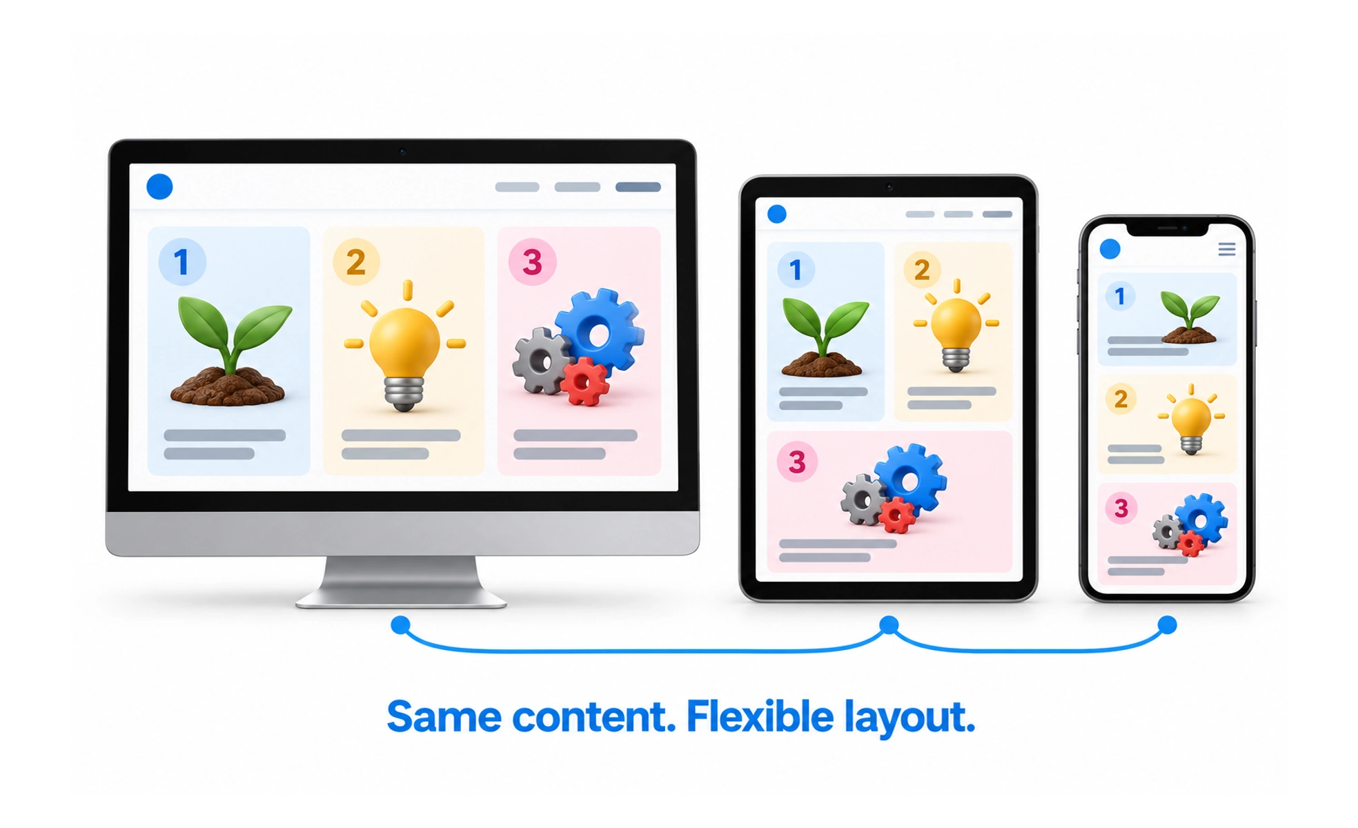
Mobile responsiveness is the ability of an interface to remain readable and usable on narrow screens and touch devices. It requires thoughtful content, layout and interaction behavior, not just smaller dimensions.
A travel version of a toolkit keeps the essential tools within reach instead of shrinking the full workshop until nothing is usable.
Prioritize the mobile task
Identify what people need to do on a phone and make the next useful action easy to find. Reorder secondary information only when the new order remains understandable. A mobile layout should not hide important content just to imitate a compact screenshot.
Design for narrow and tall content
Use readable text widths, allow labels to wrap and keep controls within the viewport. Avoid fixed-height containers that cut off content when the device is rotated or text is enlarged. Long forms and menus should scroll within a clear, usable area.
Support touch and other inputs
Give interactive targets enough space and avoid relying only on hover. Make focus, active and disabled states visible for keyboard users too. Where a gesture exists, provide an accessible alternative such as a button or menu item.
Example: profile editing
A desktop profile dialog may use a centered panel. On mobile, a bottom drawer can provide a familiar, scrollable surface with a stable action area. The content should remain reachable above the keyboard, and saving should not be hidden behind a tall form.
Frequently asked questions
Key takeaways
- Optimize for the task, not a shrunken desktop layout.
- Let content wrap and grow vertically.
- Support touch, keyboard and non-hover operation.
- Check orientation, zoom, keyboard and scrolling states.