Visual Design Principles
Learn 13 principles, from unity and alignment to hierarchy and figure and ground, that make layouts clear.
Design principles are the reasons a layout feels clear or confusing. This lesson covers 13 principles designers use every day, from unity and alignment to hierarchy and figure and ground. They rarely work alone: most good screens combine several at once.
Unity
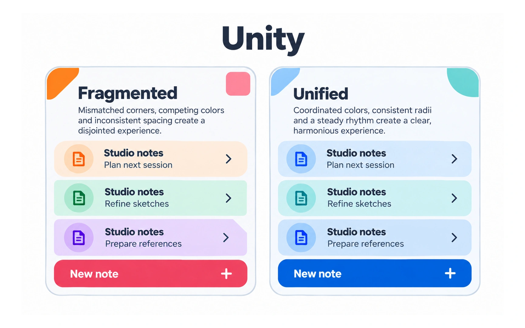
Unity is the sense that every part of a design belongs together. Shapes, colors, corners, spacing and type all follow the same rules.
The example shows the same list twice. The fragmented card mixes colors and corner styles, so each row feels separate. The unified card shares one color, one corner radius and an even rhythm, so it reads as one clear piece.
Unity makes content easier to take in and makes a product feel trustworthy. A simple way to build it is a small set of shared styles: a color palette, a type scale and spacing values used everywhere.
Alignment
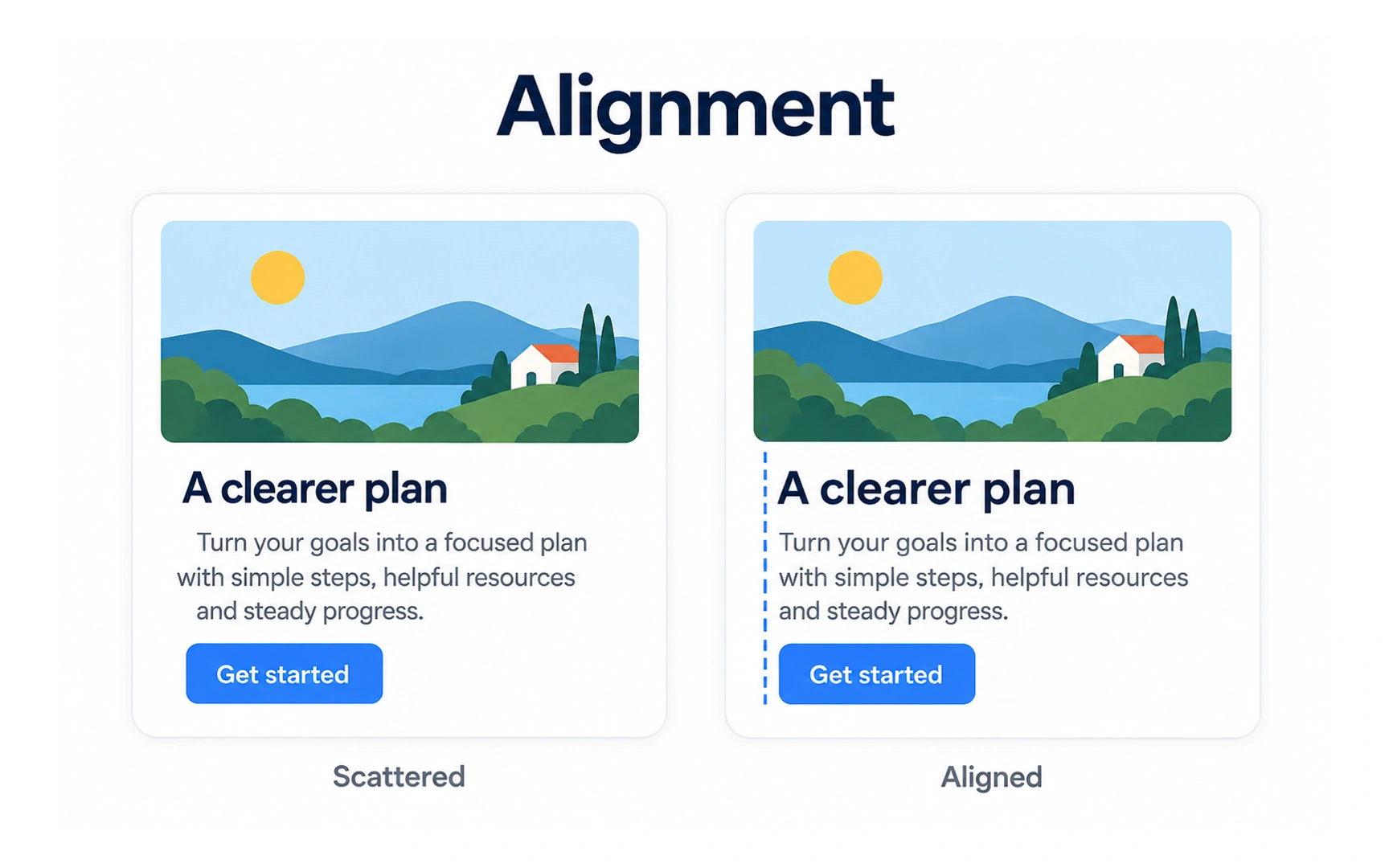
Alignment places elements along shared edges or a shared center line. In the example, the aligned card starts the headline, text and button on the same left edge.
Aligned layouts look calm and organized, and they are faster to scan, because the eye knows where each line begins.
Breaking alignment on purpose can create energy, but do it for one element, not by accident. Pro tip: use your design tool’s layout grid or auto layout so alignment stays exact.
Proximity
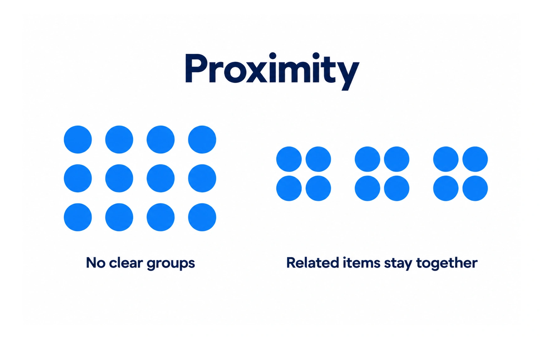
Proximity means that items placed close together look related. It is one of the Gestalt principles, which describe how people naturally group what they see.
In the example, twelve evenly spaced dots form no clear groups. Move them into pairs with bigger gaps between pairs, and the eye sees groups straight away.
Use spacing to show structure: keep a label close to its field, and leave more space between sections than within them.
Balance
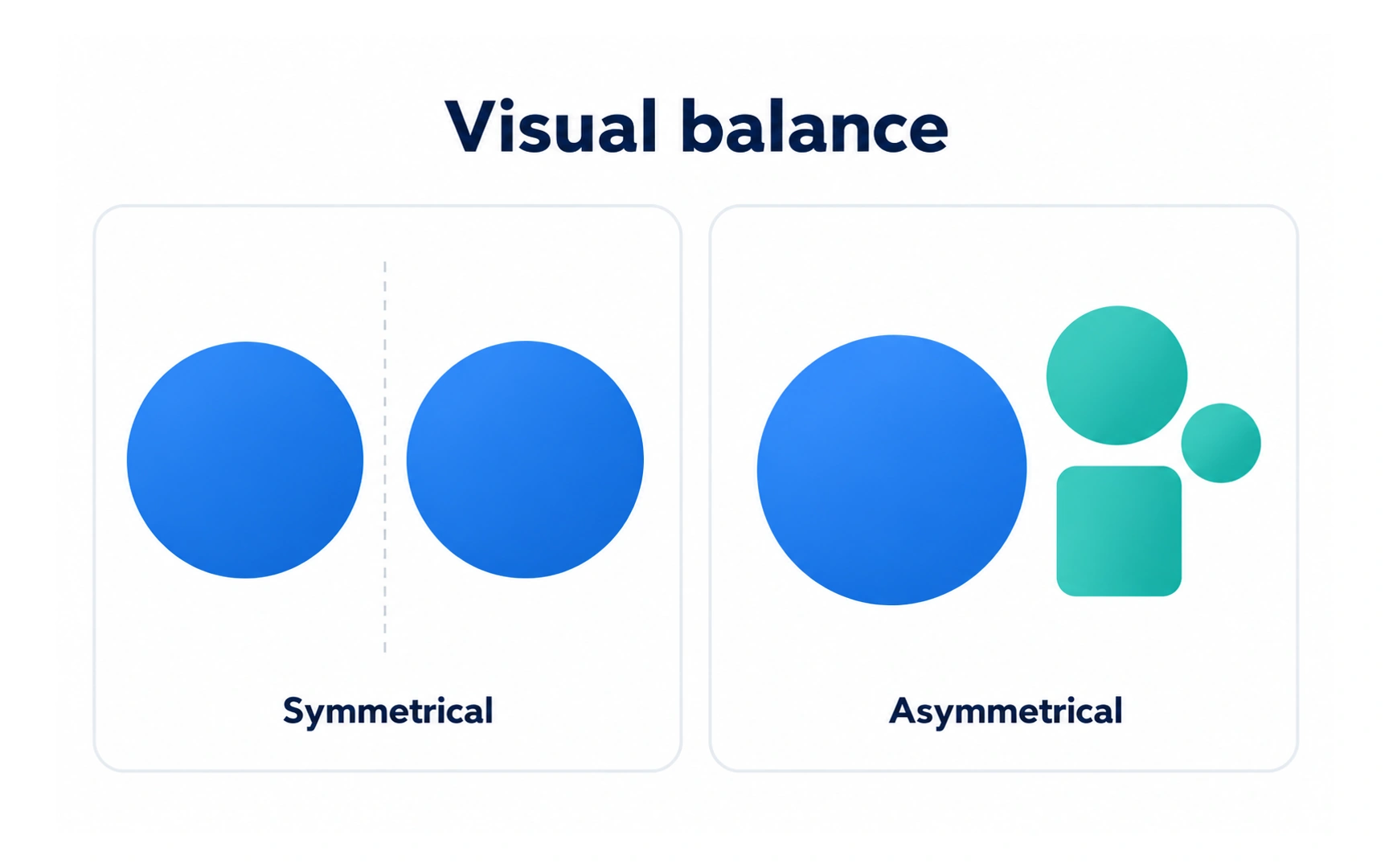
Balance is how visual weight is spread across a layout. Large, dark or bright elements feel heavier; small or pale ones feel lighter.
There are two main kinds of balance:
- Symmetrical: both sides of a center line carry equal weight, like the two matching circles in the example.
- Asymmetrical: the sides differ but still feel stable. In the example, smaller shapes offset one large circle.
Both can work. Symmetry suits formal, calm pages; asymmetry suits pages that should feel more lively.
Contrast
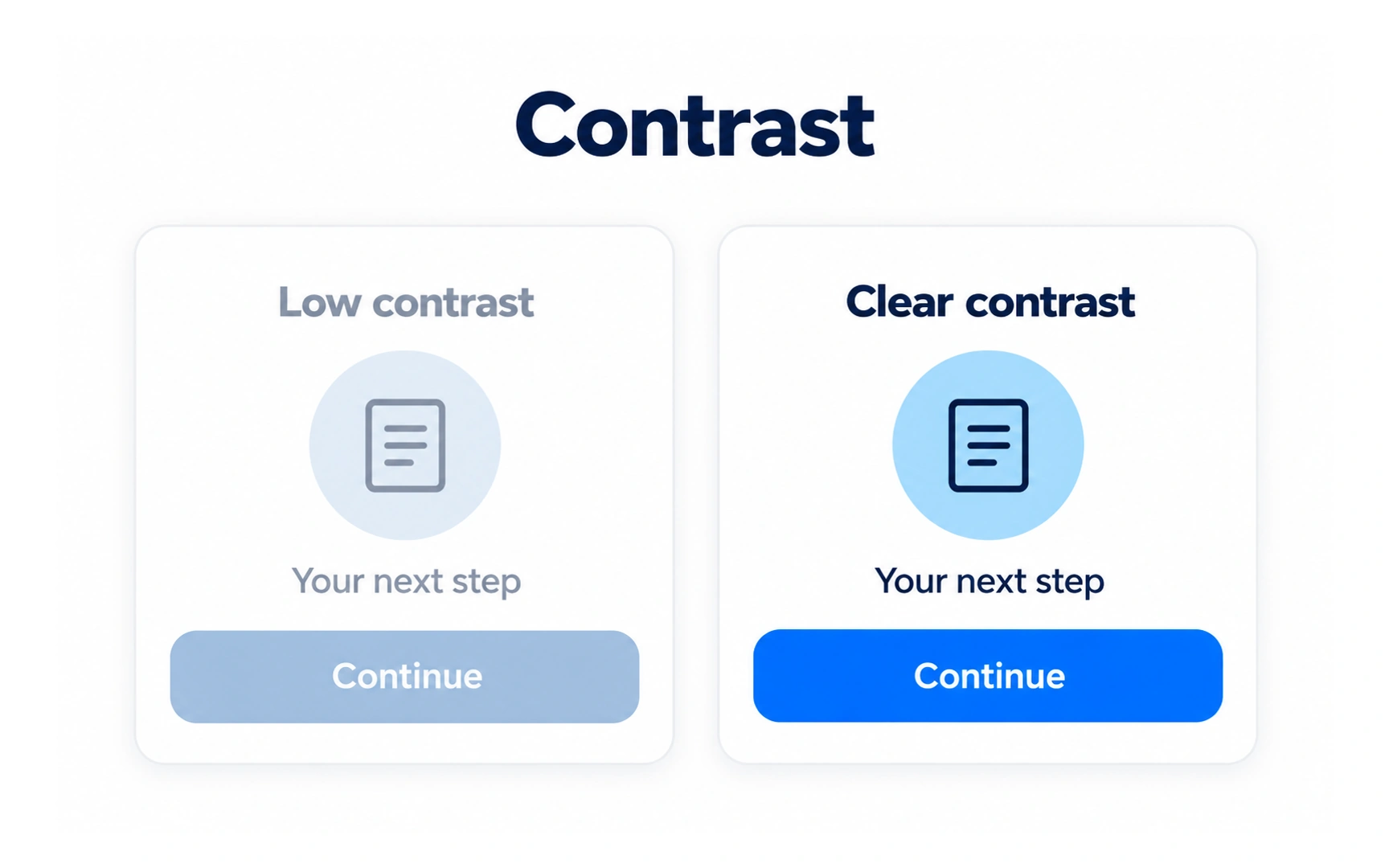
Contrast is a clear difference between elements, in color, size, weight or shape. It tells people what is different and what matters.
In the example, the low-contrast card fades into its background and the button looks disabled. The clear-contrast card makes the icon, text and Continue button easy to see.
Contrast is also an accessibility requirement. WCAG AA sets a minimum contrast ratio of 4.5:1 for normal text, measured against its background. Combine differences, such as color and weight, so the difference does not rely on color alone.
Emphasis
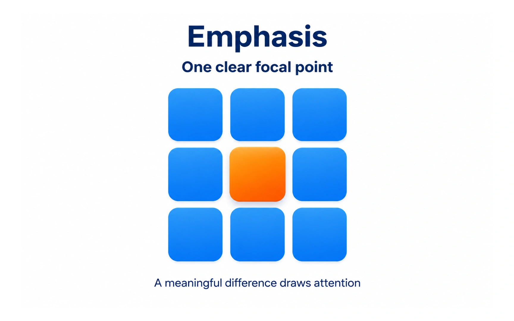
Emphasis makes one element the focal point. In the example, one orange tile among blue ones draws the eye at once.
This works because of the Von Restorff, or isolation, effect: when several things look alike, people notice the one that is different, and it can be easier to remember.
Contrast creates a difference between elements; emphasis uses that difference to make one element the most important. Save it for the thing people most need, such as the main action on a screen.
Repetition
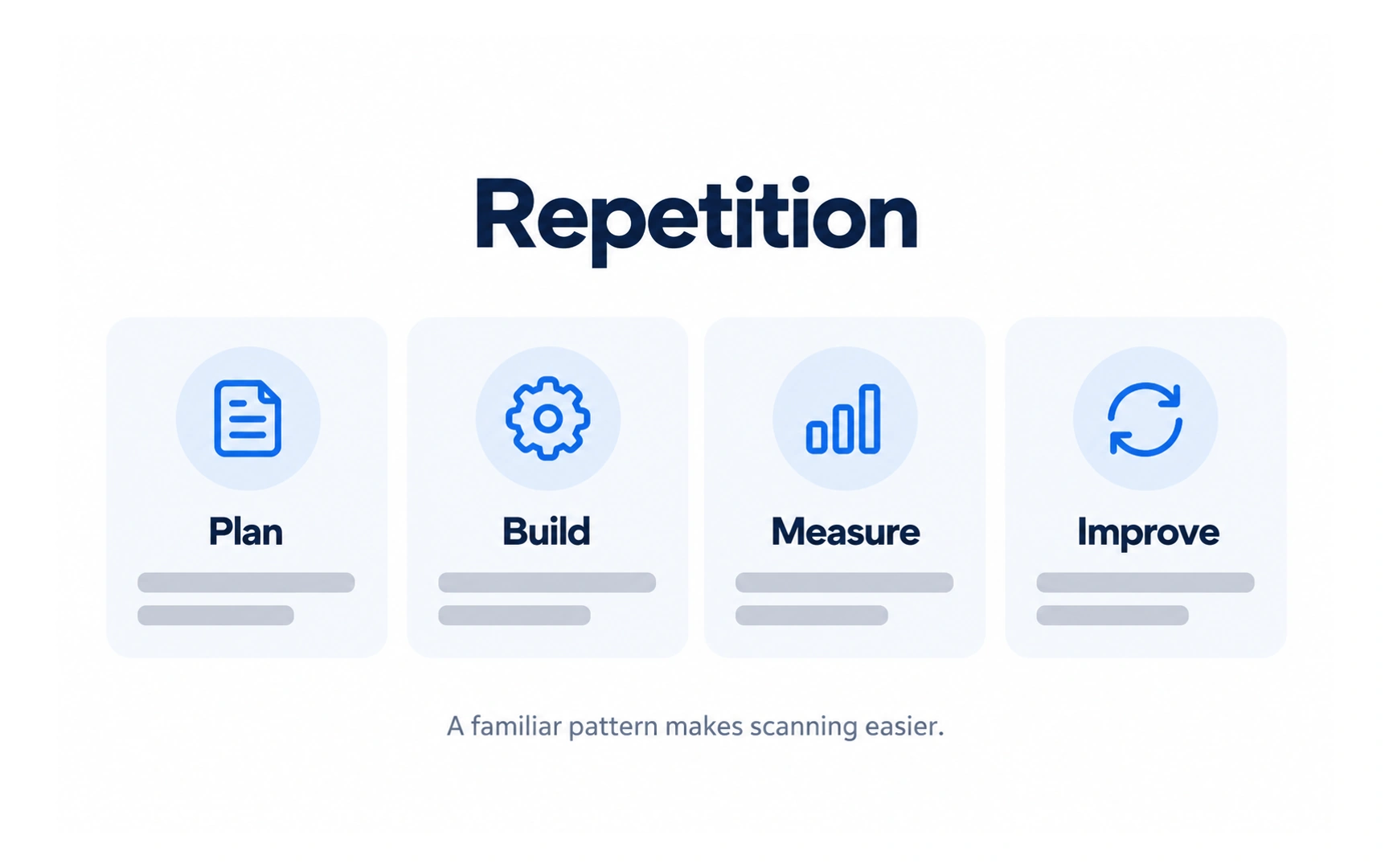
Repetition means using the same styles and patterns again and again. In the example, Plan, Build, Measure and Improve share the same card, icon style and layout.
Once people learn a pattern, they can scan the rest quickly. Repetition also links to the Gestalt principle of similarity: items that look alike are seen as belonging to the same group.
Repeat what should feel the same, such as cards in a list, and change what should feel different, such as a featured item.
Movement
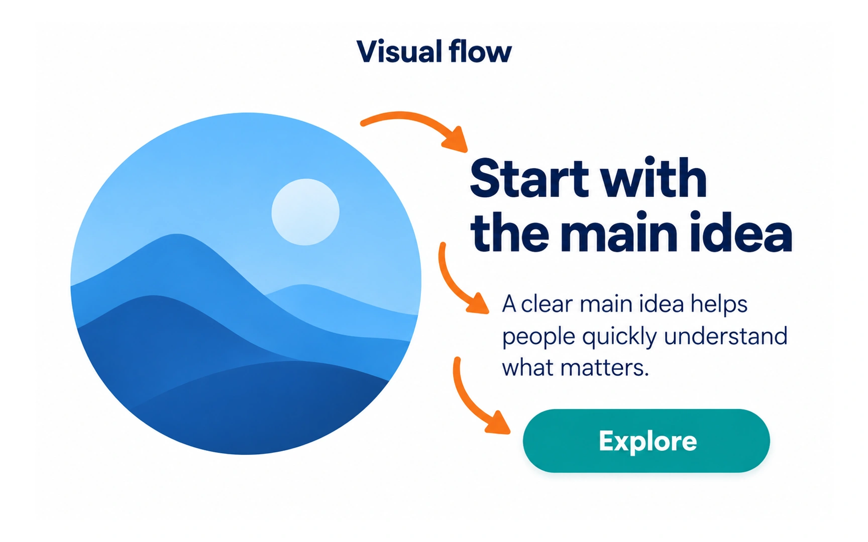
Movement, or visual flow, is the path the eye follows across a design. Nothing has to move on screen.
You can guide that path with:
- Size and weight: large, bold elements are seen first.
- Color: bright or saturated colors attract attention.
- Position: people usually start near the top left in left-to-right languages.
- Direction: arrows, lines and the gaze of people in photos point the way.
In the example, the eye goes from the large image to the headline, then the supporting text, and finally the Explore button. Design that path so it ends on the action you want people to take.
Negative space
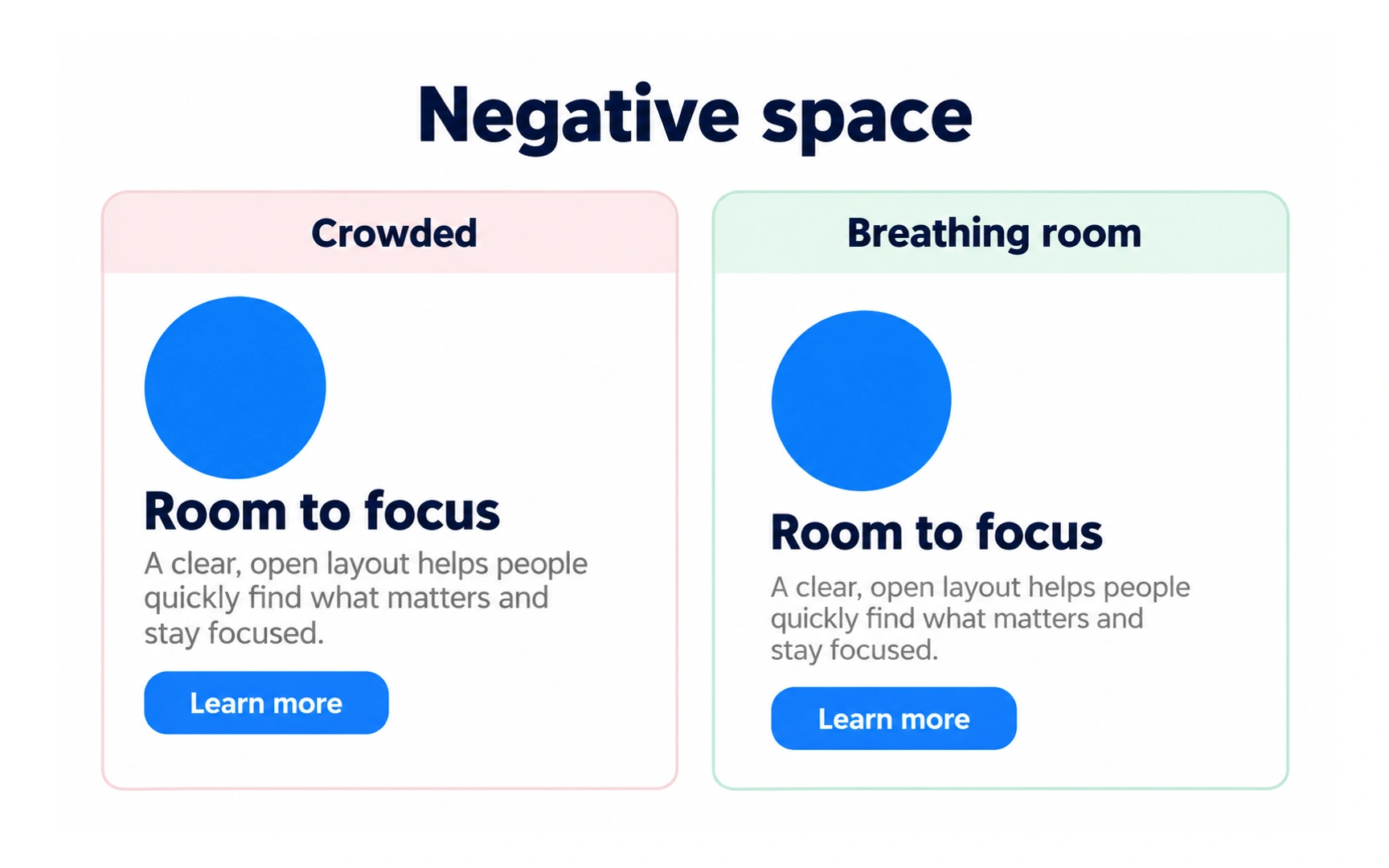
Negative space is the empty area around and between elements. It is often called white space, but it can be any color.
The example shows the same card crowded and with breathing room. With more space, the heading, text and button are easier to read and the card feels calmer.
Space is also the quickest way to make something stand out: leave room around it. Empty space is not wasted space; it is part of the design.
Hierarchy
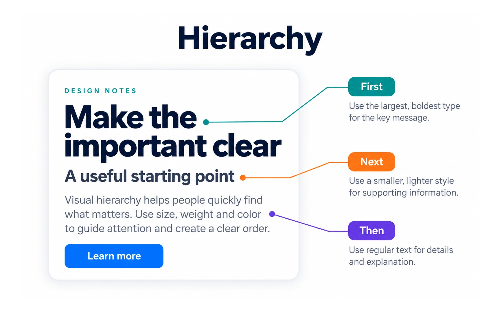
Hierarchy shows the order in which to read things. In the example, the headline comes first, the subheading next, and the body text after that.
You create hierarchy by combining other principles: size, weight, color, contrast, spacing and position.
Pro tip: start with three or four clear levels, then add more only when the content needs them. Too many sizes and weights blur the order.
Proportion
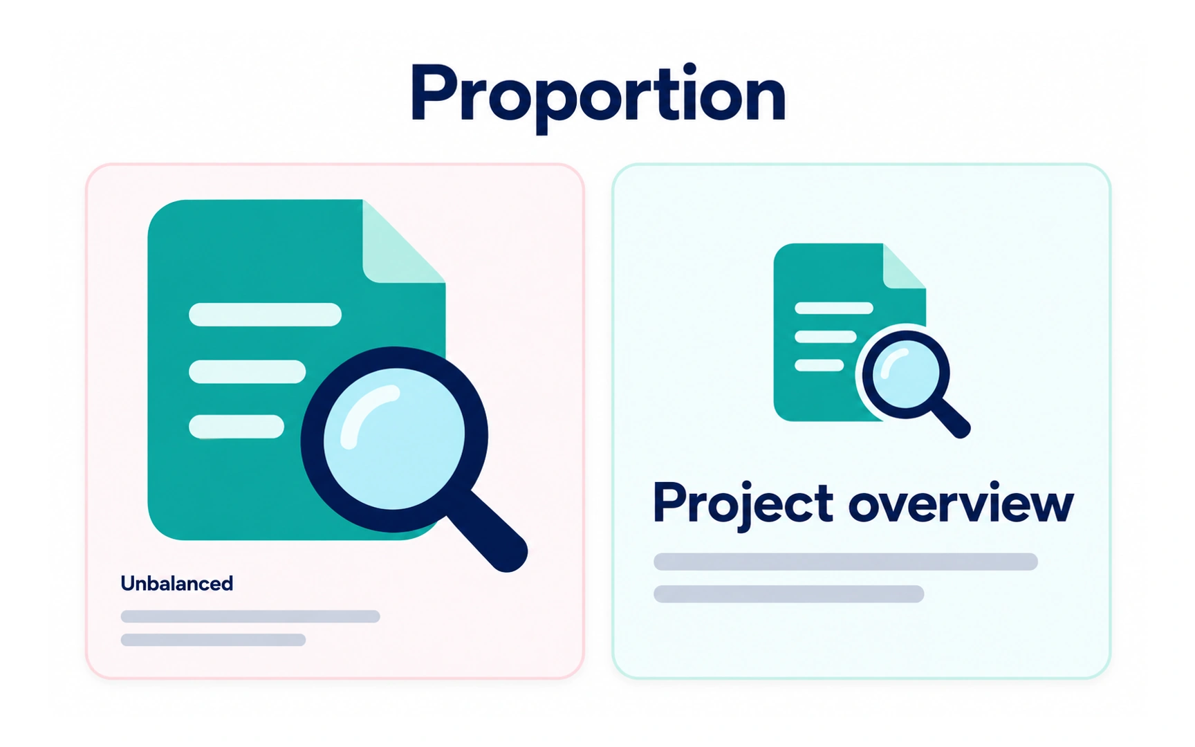
Proportion is how the sizes of elements relate to each other. Bigger elements look more important, so sizes should match importance.
In the example, the unbalanced card lets a huge icon crowd out the content. In the balanced card, the icon and title are sized in proportion, and the title gets the attention it needs.
Check proportions on each screen size, because a ratio that works on a laptop may feel too big or too small on a phone.
Continuation
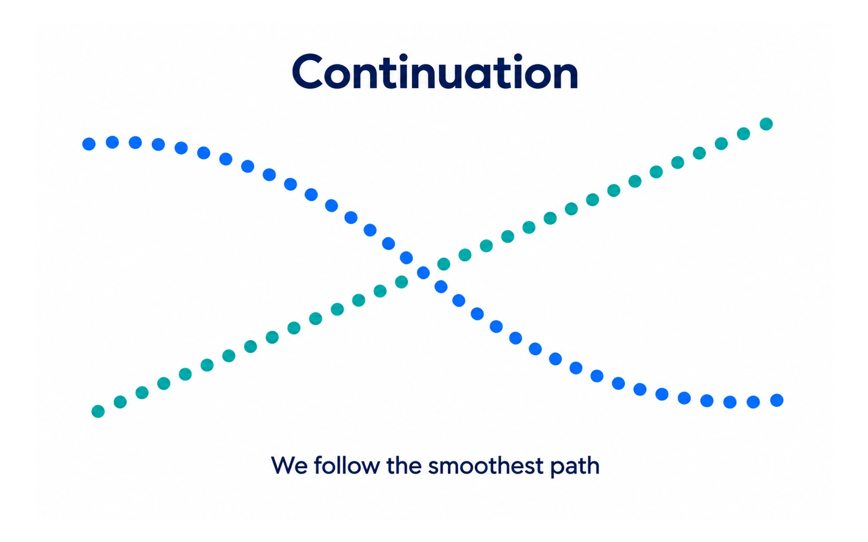
Continuation is the Gestalt principle that people follow lines and curves along their smoothest path.
In the example, two dotted lines cross. We see two smooth paths, not four lines meeting in the middle, because the eye keeps going in the same direction.
Designers use continuation to lead the eye, for example with a progress line that shows where a process is heading. A related cue: a card clipped by the screen edge signals that more content is there to scroll to.
Figure and ground
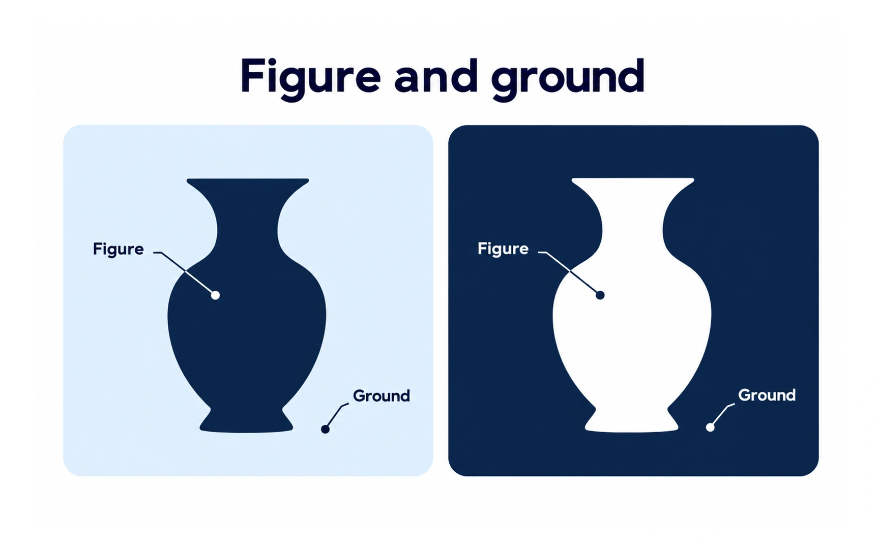
Figure and ground describes how people separate what they see into a foreground, the figure, and a background, the ground.
In the example, the vase is the figure in both panels. On the left it is dark on a light ground; on the right it is light on a dark ground.
Interfaces use this all the time: a dialog over a dimmed page, or a card on a tinted background. Make the figure clearly different from the ground so people know where to focus.
REFERENCES
- 1. Using Gestalt principles in UX design | Medium
- 2. Von Restorff Effect | Laws of UX | Laws of UX
- 3. Improve Your Designs With The Principles Of Continuation And Common Fate (Part Three) — Smashing Magazine | Smashing Magazine
- 4. Improve Your Designs With The Principles Of Closure And Figure-Ground (Part 2) — Smashing Magazine | Smashing Magazine
TOPICS
FROM COURSE