

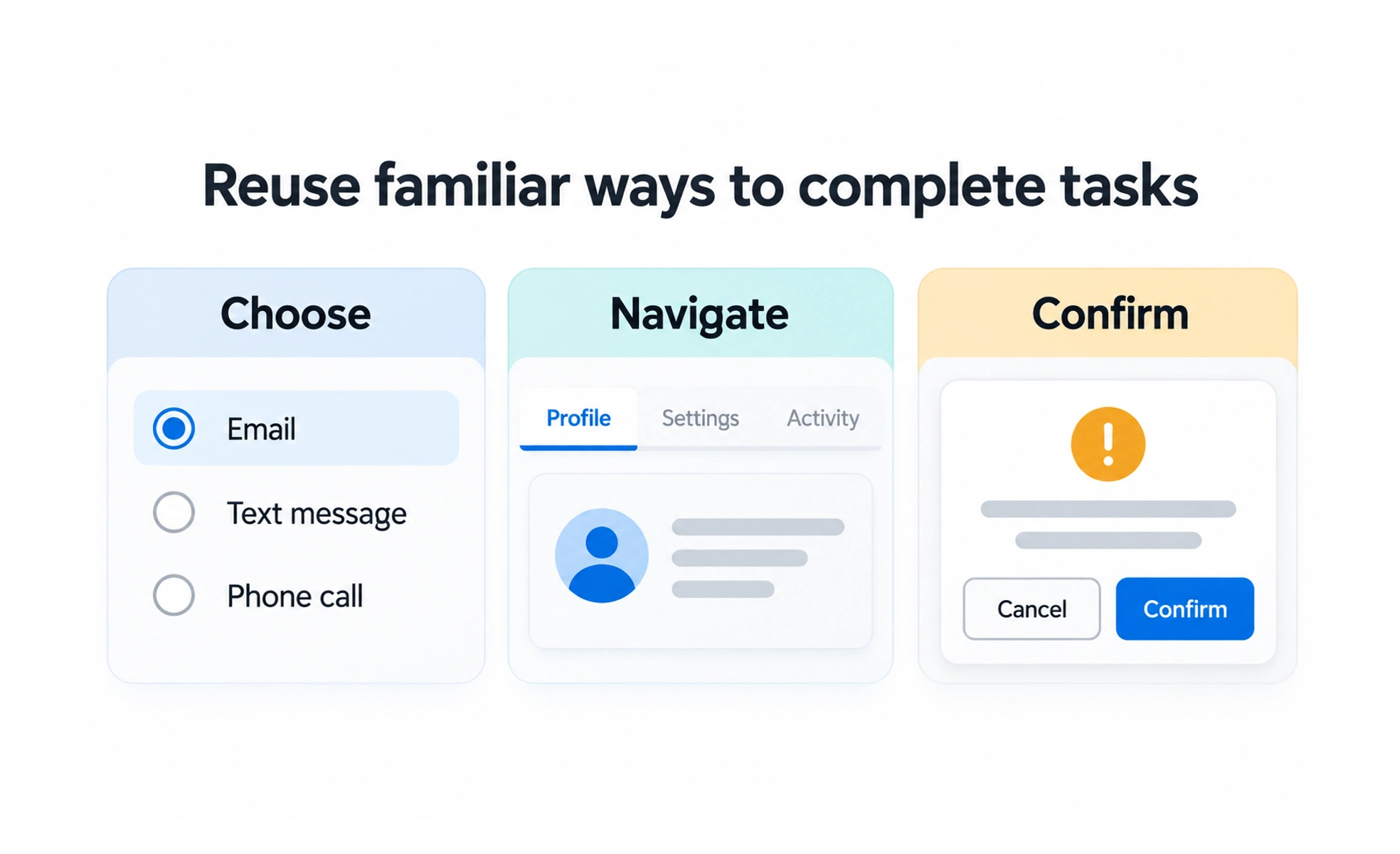
Patterns help teams avoid inventing a new interaction for a familiar problem. When used consistently and with the right context, they make behavior easier to recognize and learn. A pattern should serve the user’s task, not simply match a trend.
Road signs use familiar shapes and placement so travelers can react without decoding each one from scratch. Interface patterns provide similar learned cues, while still needing clear labels and context.
Begin with the user’s task
A pattern should help someone do something: move between sections, select one option, reveal details, or recover from an error. Identify the task and its constraints before choosing a component. Similar-looking controls can create very different expectations.
Use convention with care
Familiar patterns reduce learning effort, but conventions vary across platforms and audiences. Use established behavior when it fits. If a product needs a departure, make the difference visible and explain it through clear labels, feedback, and predictable consequences.
Design all important states
A pattern includes its empty, focused, selected, disabled, loading, and error states where relevant. It also includes keyboard and assistive-technology behavior. A component that looks correct only in its default state is not a complete interaction pattern.
Document and evolve patterns
A shared library should explain when to use a pattern, its behavior, and known limitations. Teams can then reuse it without copying errors. Review patterns as product needs and accessibility knowledge evolve, and allow justified exceptions rather than creating inconsistent duplicates.
Frequently asked questions
Key takeaways
- Choose a pattern based on the task and context.
- Use familiar conventions when they meet user needs.
- Specify important states and accessible behavior.
- Document usage guidance and evolve shared patterns deliberately.