
Understanding User Experience
Learn to recognize experience problems, connect design decisions to real tasks and test what helps people.
A product can look excellent and still make a simple task difficult. This lesson explores how to recognize that gap, investigate it and choose a useful next step.
What an experience includes
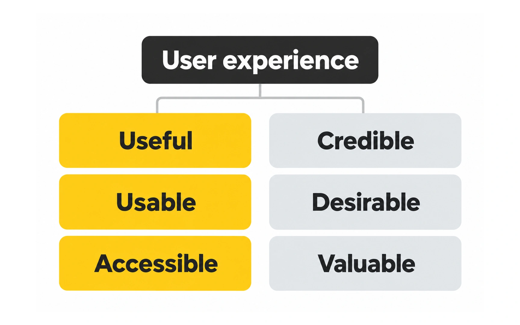
User experience (UX) is the whole experience of using a product or service: finding it, learning how it works, getting something done and how you feel afterwards. It includes what happens beyond the screen.
Consider ordering coffee on a phone. Finding a drink, choosing a collection time, paying and collecting the correct order all matter. An attractive ordering screen cannot make up for unclear collection instructions or an order that never arrives.
The illustration offers several lenses for judging an experience. Start with usefulness and ease of use, then consider access, trust and the other qualities shown. These are prompts for investigation, not a score that guarantees success.
Pro tip: before asking whether a design looks good, watch someone try an important task. Notice where they need help or lose confidence. For a one-time task, such as renewing a passport, finishing smoothly may be the whole goal.
Designing around a real task
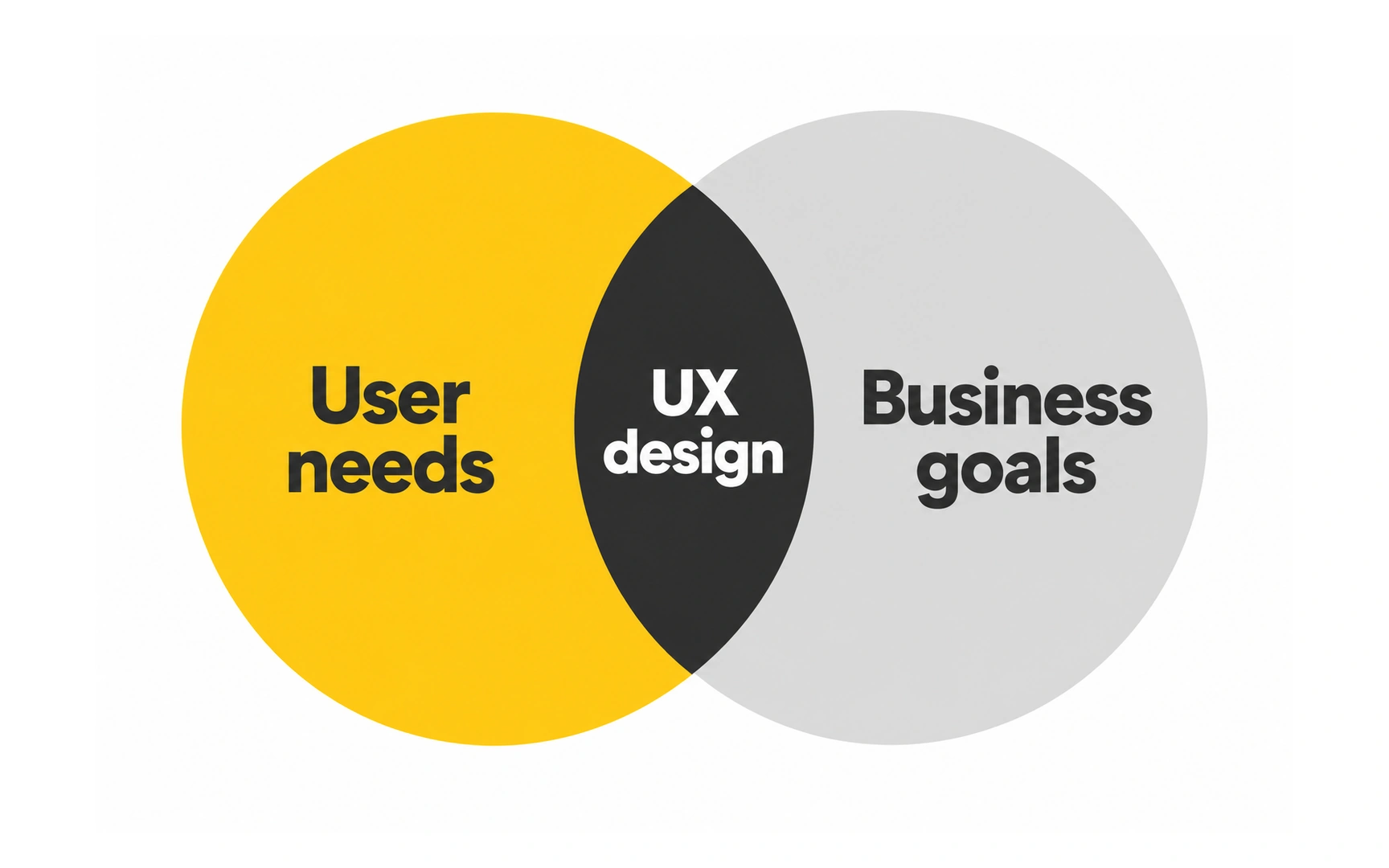
UX design is the work of improving an experience deliberately. Designers learn about people and their circumstances, identify obstacles, explore alternatives and test whether a change helps.
A library wants more people to reserve books online. Interviews might reveal unfamiliar terminology; observation might show that readers cannot tell which branch has a copy. Each finding suggests a different problem to solve.
A useful design decision balances the reader’s goal with operational needs, such as accurate availability and manageable collection queues. Research informs a decision; testing checks it. Neither attractive screens nor a longer feature list proves that the experience improved.
Research tip: ask someone to show you how they last reserved a book. A real example often reveals details that a question like “Would you use this?” misses.
How UX and UI work together
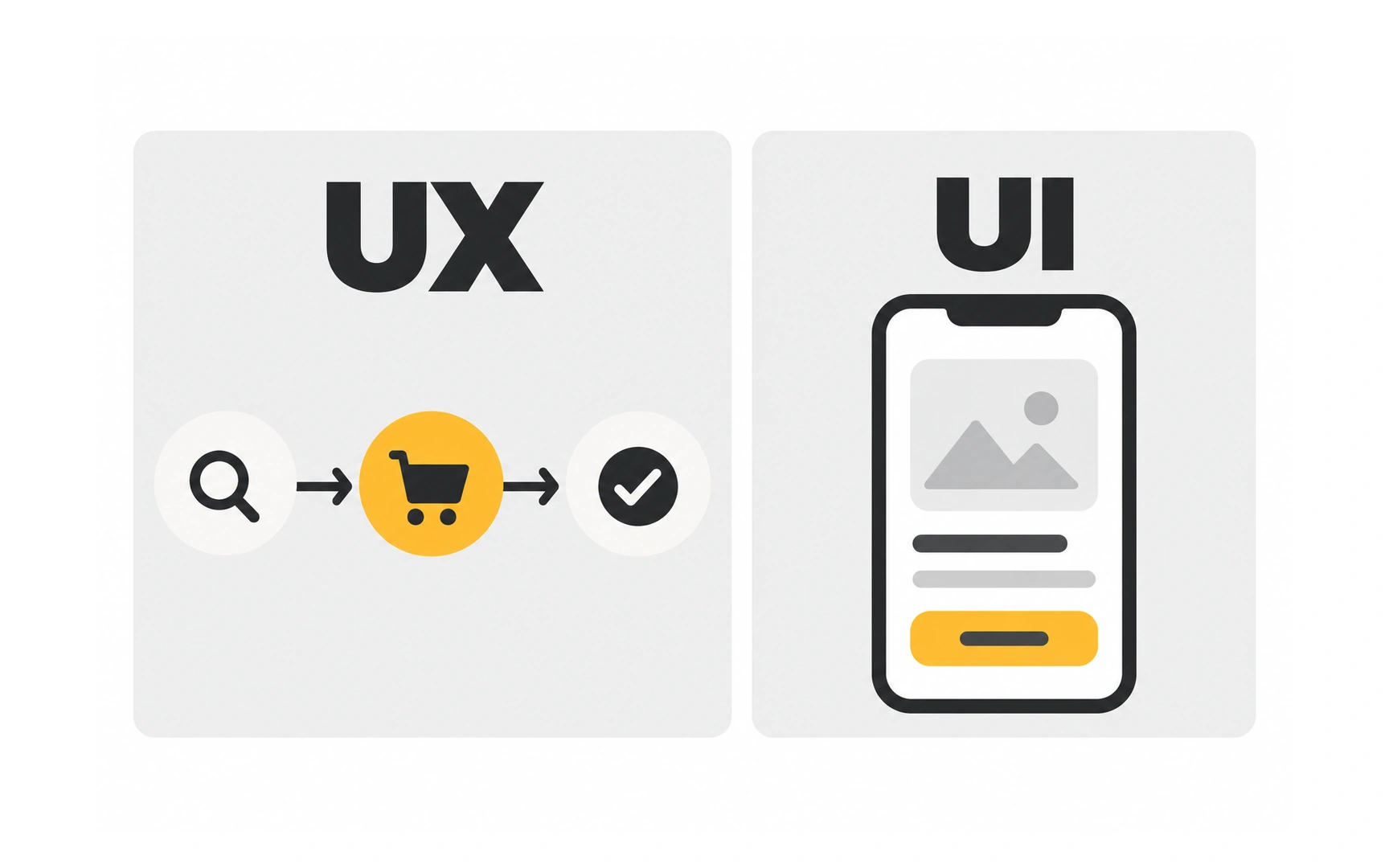
UX concerns the experience of reaching a goal. User interface design shapes the controls and information through which people interact with a product. Interface decisions include visual hierarchy, labels, states and feedback, not decoration alone.
In a ticket app, choosing when seat selection happens affects the journey. Making available seats distinguishable and showing which seat is selected are interface decisions. Both influence whether someone can buy the right ticket.
These responsibilities overlap and teams divide them differently. The useful distinction is the question being answered: does the journey support the task, and does the interface make each action understandable?
A short history of UX
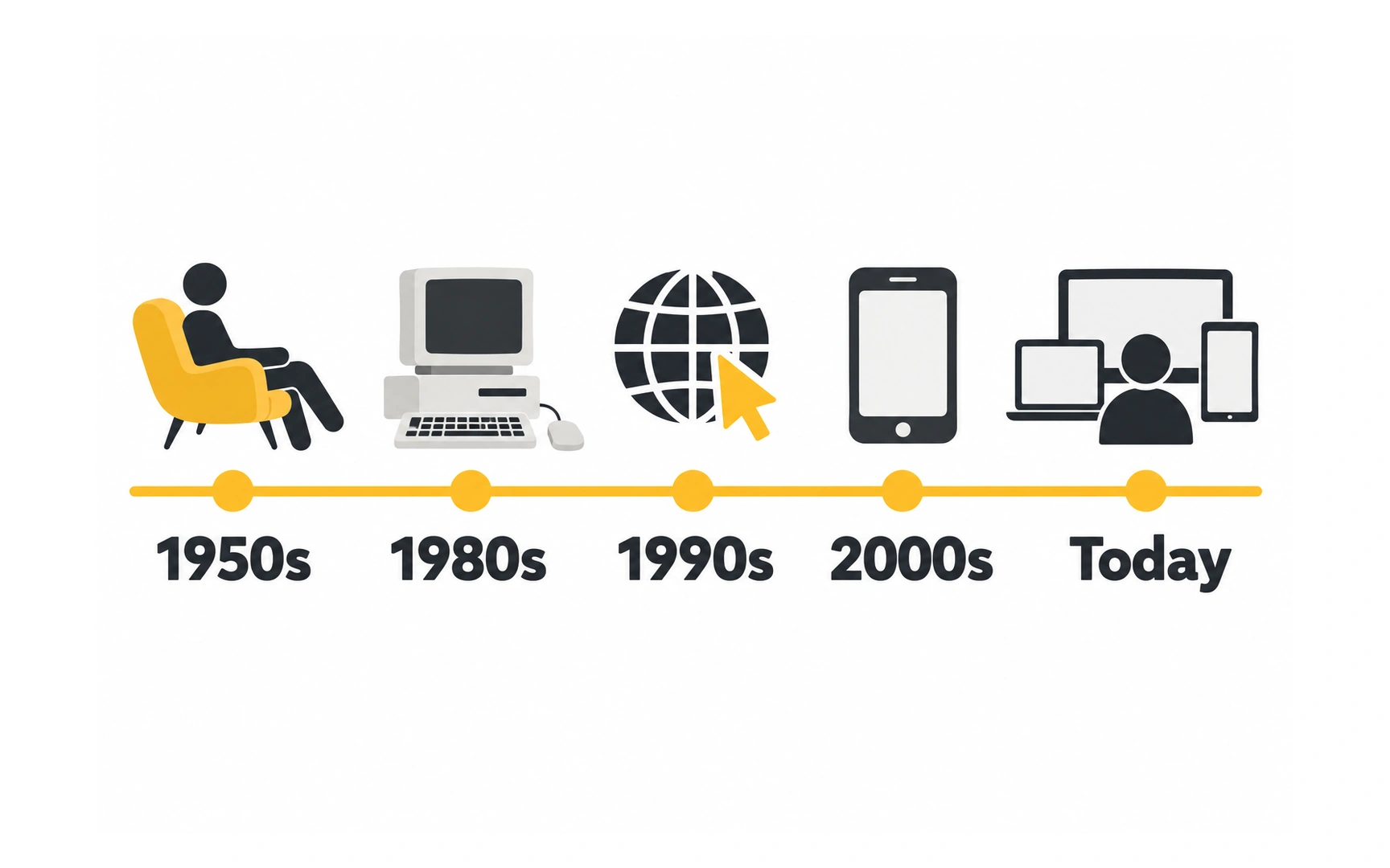
UX grew from a long-standing question: how can tools work better for the people using them? Computers changed the setting, but they did not invent the need for clear actions and useful feedback.
1984: Apple released the Macintosh with a graphical desktop and mouse. It helped bring this way of interacting with computers to a wider audience; it was not the first graphical interface.
1990–1994: Jakob Nielsen and Rolf Molich developed usability heuristics, and Nielsen refined them into the ten principles widely used today. These principles help teams spot common interface problems.
1993: Don Norman joined Apple using the title User Experience Architect. His work helped popularize a broader view of experience, beyond the interface alone.
The dates matter less than the change in perspective: a working feature is not enough. Designers also ask whether people can understand it, use it and trust the result.
People who shaped UX

Don Norman helped popularize user experience as a broad design concern while working at Apple in the 1990s. His perspective includes the product, the surrounding service and the person’s experience of using both.
Jakob Nielsen is known for ten usability heuristics: practical principles for reviewing an interface. They grew from work with Rolf Molich in 1990 and Nielsen’s later refinement. For example, people should be able to tell what the system is doing.
Alan Cooper popularized personas in interaction design. A useful persona brings research about a group’s goals and behavior into design discussions. It is not simply a fictional biography or a list of demographic details.
These contributions help answer different questions. Look across the journey, inspect an interface or focus on a user group’s goals—then check your assumptions with evidence.
Helping people find their way
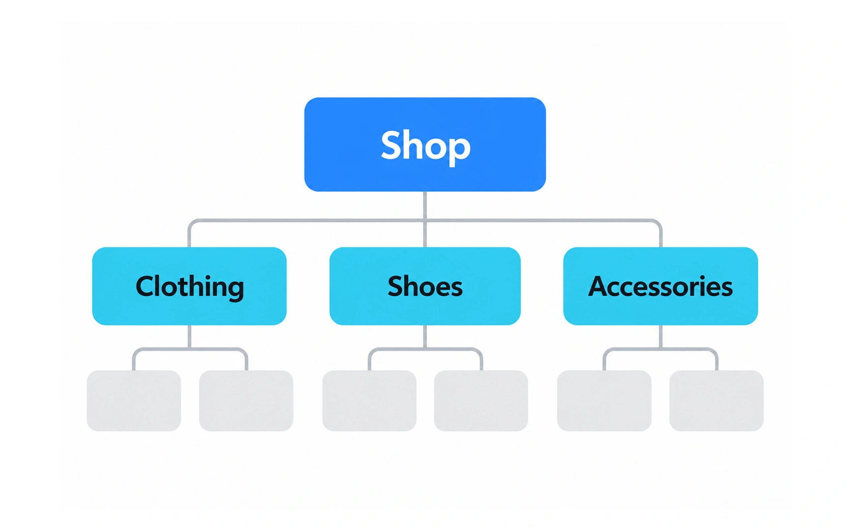
Information architecture organizes and labels content so people can locate and understand what they need. It connects individual pages into a structure that supports real tasks.
A community center could group sessions by activity, age range or day. A parent searching for a Saturday swimming class may need more than one of those routes. The right structure depends on what visitors are trying to find.
Use labels people recognize and test a small set of realistic finding tasks. If visitors repeatedly choose the wrong category, investigate the grouping and wording before adding more visual emphasis.
Labeling tip: ask visitors where they would look for a Saturday swimming class before showing your menu. Their words can suggest clearer labels than your team’s internal names.
Exploring and testing ideas
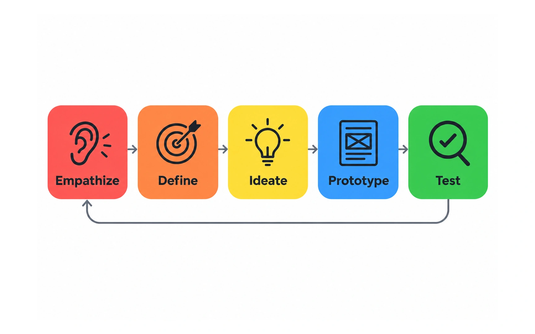
Design thinking offers a way to explore a problem before committing to a solution. Understanding people, framing the problem, generating ideas, prototyping and testing are useful activities; they need not form a rigid one-way sequence.
Suppose passengers miss collection instructions in a travel app. The team can explore a clearer message, a map or a timed reminder, then prototype promising alternatives. A test may reveal that the real issue is an unfamiliar meeting-point name.
Go back when evidence changes the problem. Generating many ideas is useful only when the team also checks which ideas address the need and what trade-offs they introduce.
Removing an avoidable barrier
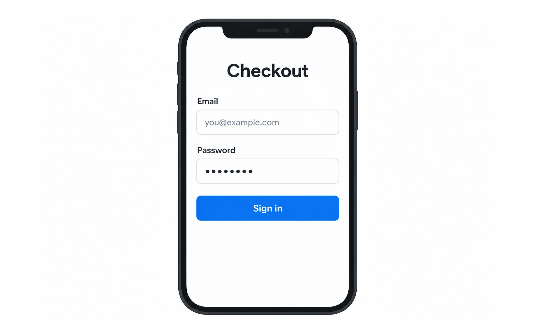
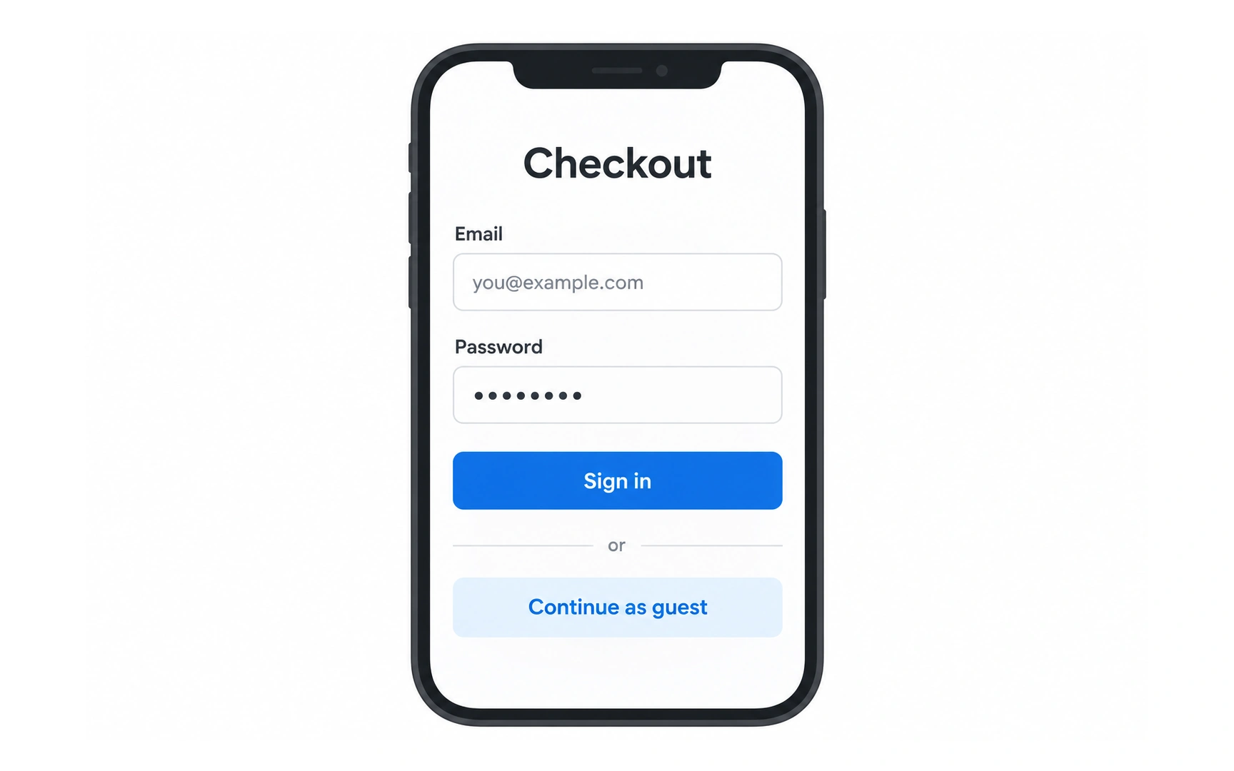
The comparison illustrates two checkout approaches: requiring an account before purchase and allowing a guest route. Consider a first-time shopper who wants one item and does not want to create an account.
Guest checkout can remove a registration barrier, but it still needs clear delivery details, payment steps and an order confirmation. Some products have genuine identity requirements; explain those requirements rather than hiding them until the last step.
Treat an improvement as a hypothesis. Check task completion, errors and relevant operational outcomes after a change. Do not promise a particular revenue increase simply because another business reported one.
Checkout tip: make the guest route easy to spot, then explain how shoppers will receive their receipt and track their order without an account.
TOPICS
FROM COURSE